Country vs Species Map Visualization
Licensed by : IUCN 2020. IUCN Red List of Threatened Species. Version 2020-1 here
P.S. Request to wait for few minutes to load map visualization as it consist of multiple geospatial maps
Encoding
In the map, data is encoded on as color on a multiple choropleth visualization on an equal area map projection. Each colored shape is a country, and data is encoded as follows :
Interactivity
First of all click on button to load map and wait for few minutes so that map is loaded completely.
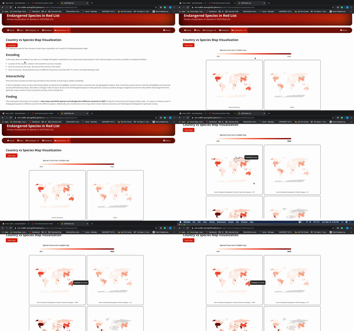
In this visualization, there are two interactivity details on demand and highlight. So when mouse is hovered over any geographic location, then it will show county name in tool tip and highlight and raise that country with black boundary. Also there is change in title of map to show count of Endangered species in that particular country as well as change in legend max and min value which shows legend for that particular map on which mouse is pointed currently. Here is the gif of it.

Finding
This visualization will answer the question : How many and which species are Endangered in different countries in 2020 ? Using the interactivity and having multiple maps , it is easy to compare count of Endangered species in different countries for different species. Additionally, also mentioned 2 more maps which shows Total by Taxonomy and Total Species Endangered in particular county. Using this visualization, it is clear that plants are highly endangered , followed by fishes , due to deforestation and consumption of sea food as well as sea pollution respectively.