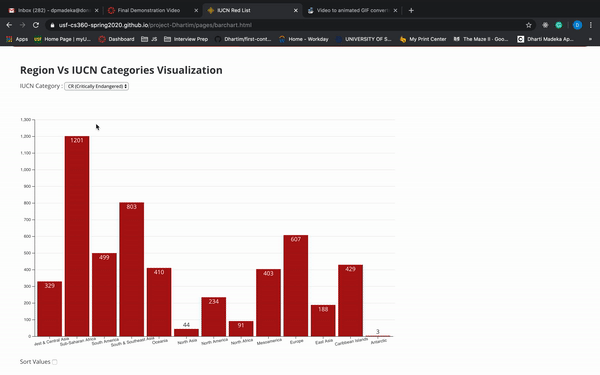
Region Vs IUCN Categories Visualization
IUCN Category :
Licensed by : IUCN 2020. IUCN Red List of Threatened Species. Version 2020-1 here
Encoding
The data is encoded over bars. Each bar represents Number of Endangered species in each categories across each region. Width and number is summation of species in that particular region in that particular IUCN Category.
Interactivity
Interactivity used are Filtering , Sorting and Zoom. Filtering will filter out IUCN Category and show bars accordingly in each region. Sorting will sort bars in decreasing in the visualization. Zoom will increase bar width a little when zoomed in. Here is .gif of it.
Finding
This visualization helps to answer the question: Which Region has highest count and how many species fall in various IUCN category? It shows that North America rank 1st in Extinct species Category. While Sub-Saharan Africa is highest in the rest, i.e. Critically Endangered, Endangered and Vulnerable. Also there is highest number of species in Least Concern in Sub-Saharan Africa too, it is due to variety of species found in Africa.