Sum of Number of Records for each Neighborhooods
by Jake Zhong, Mar 1, 2020
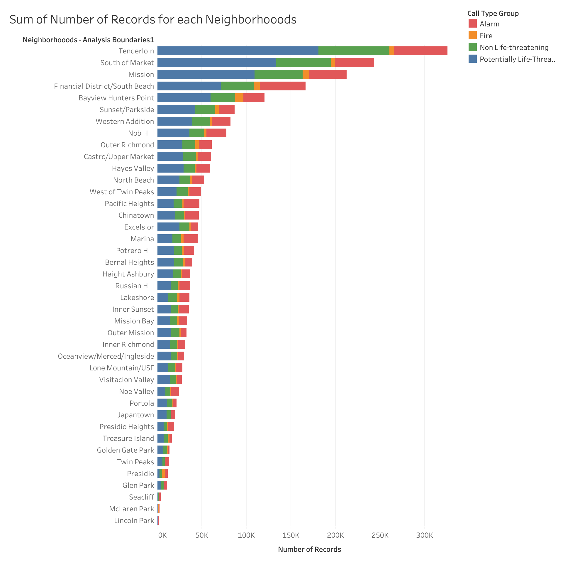
In this prototype, I used the number of records as rows, neighborhoods as columns and call type group as color to demonstrate the number of emergency call occuring in different areas and their types. From the chart, we know that Tenderloin, South of Market and Mission areas have the largest number of records.
For this visualization, I want to have some interaction to help users understand the data better. For example, I will add a highlight, when a user hovers the bar, it will give a exact information of the number of records for the area and each call type. Besides, if user clicks on one call type on a bar, it should jump to another chart created by my teammate, which will display more detail about that type over time.
In terms of the theme, we want to answer the question: is the San Francisco Fire Department fully equipped to handle the multitude and wide range or emergencies that occur in San Francisco. My chart can indicate the number of records occuring in different areas of San Francisco, so we can know what area has the largest number of records and if the fire department can handle them in time.
Peer Feedback
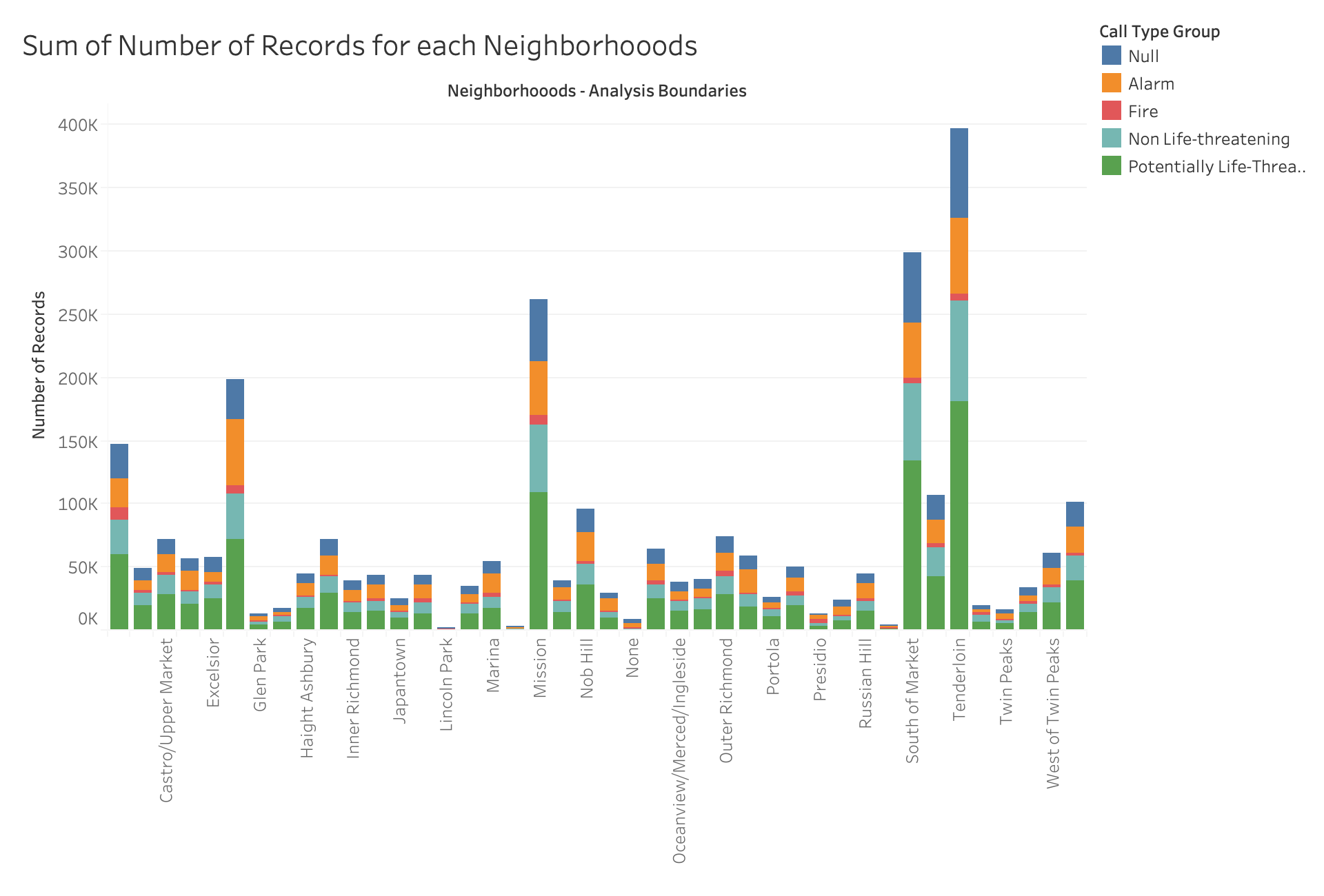
- missing labels and none value for some of the x axis and having null as call type group in legend.
- The data can be filtered out as call type group not null. The visualization is great, but it lacks some label for the neighbourhoods. The interactivity can be improved.
- their website is pretty enough. the prototype shows 4 different incident type in 4 different colors.
- Some neighborhood were filtered out from axis and you can remove the null type if you want unless your gonna use it for something like how you said.
- You should remove the NULL values because it creates an unnecessary length of the data. The axis does not showcase the names of all the neighbourhoods and that is something that should be addressed and should be filtered. I would also choose a color scheme that is able to cater to the colorblind. I really like the idea of comparing the chart and linking the data with the other group members.
- Filter out the null data type. Possibly for the D3 you can sort the bar graph and do a popup to see more data from a specific neighborhood. Additionally, maybe also for the popup, you can also include statistics about a neighborhood's most common call type (ie: emergency/non-emergency).
- I'm sure you'll change it, but keep in mind of the missing names on the x-axis! great job keeping the years consistent between all visualizations (2010-2019).
- Not all of the neighborhoods on the x-axis have labels, so it would be helpful to have all of them, or have context to why not all the neighborhoods were labels. There's a "Null" call type group; it would be helpful to relabel that as "Other" or provide context as to what null means.
- You should say how many years this graph covers. Some of the neighborhoods don't have labels on the X-axis, so you can't tell what data it belongs to. Some neighborhoods have a lot more calls so it's hard to tell detail about the neighborhoods with fewer accidents (the interactivity will fix this).
Solutions
- First thing I need to do is to remove the "NULL" from the call type group, since it makes no sense in this chart.
- Some labels on the axises have been cut-off. I guess the biggest reason is due to the chart's size, so I will adjust the canvas of the size when I implement it in d3.
- The rotation of the labels make them very hard to read, so in the implementation, I will switch the directions of the x-axis and y-axis to make the neighbourhoods' names more readable. It means it will be a horizontal bar chart rather than a vertical one.
- Some labels of neighbourhoods are also missing from this chart, so I will make them up in my implementation.
- This chart also missed to mention the period of this data, which are the years then this data covers. I will add the year to my implemation too.
- In terms of some small bars, the data density is too high to determine the actual data, So I will add tooltips and zooming in interactivity to help my reader recognize them.
- It's also hard to tell the actual data and ratio of each call type in the bar, since this chart doesn't provide enough information for the number. I will cover more information for the number in the tooltips as well in my implementation.
Modified Prototype