- (Image Source - Best Business Intelligence and Data Visualization Tools for 2029 - February 21, 2019)
D3 Prototype (Beta Release)
See Interactivity Guide for the visualization.
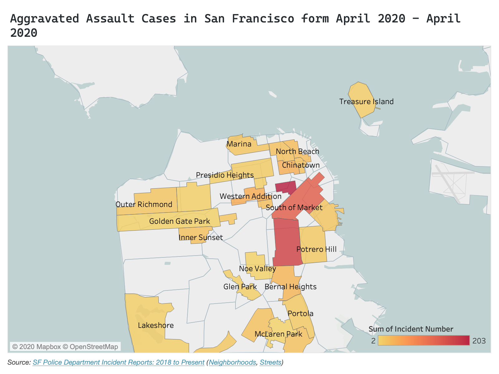
Aggravated Assault Cases in San Francisco form February 2020 - April 2020
Question
Which neighborhood has the most Aggravated Assault Cases in the month of February, March, and April? Have the number of cases decreased due to lockdown?
Answer
- The answer for the first question is easy to find from the D3 Prototype. You can easily see from the prototype that the neighborhoods of "Mission", "Tenderloin", and "South of Market" have the maximum number of cases in the given time period. However, it is very hard to determine, which neighbour out of three has the most number of incidents, A better way to represent this will be to use a Cholreopleth map. A tableau prototype for the above dataset visualized in a chloreopleth map is given below.
- The answer to the second question is difficult to answer from the prototype without some filtering. I have implemented filtering on the legend which can be accessed by clicking on the legend color box of the particular month. After filtering the visualization, we can see that for the month of April, the number of cases are relatively low than the previous month. For the month of March, as the data is for the whole month and not from the date of the lockdown (there is a lie factor), we cannot say if the lockdown change the number of cases. Some data points overlaps each other which will be fixed before the final release. Also, as the data is dense, creating a scatter plot matrix or a bar chart (for the final release) to answer this question will be a better option.
- Note: There are two data point (outliers) of whose neighborhoods are blank and will be removed before the final release.
Data Encoding
- The circles represent the location (lattitude and longitude) of every request for Aggravated Assault cases for the month of February, March, and April. The circle is enclosed as per the request source.
-
Color show the Aggravated Assault Cases by month -
- February
- March
- April
Wrangling
The dataset for the below prototype is wrangled in the following way:
Filtered By:    Incident Datetime between "Feb 1, 2020" and "April 28, 2020",
                Incident Category as "Assault"
                Incident Subcategory as "Aggravated Assault"
                Latitude is "not blank"
                Longitude is "not blank"

Basemap:        SF Find Neighborhoods
Streets:        SF Street names

Aggregated By:  Incident Number (count)
Interactivity Guide
This visualization will have the following interactivities:
| Interactivity | Status |
|---|---|
| Ability to zoom the map by scrolling up or down. |
|
| Ability to filter the map based on month by toggling the circle box in legend. |
|
| Clicking a particular neighborhood will zoom that neighborhood |
|
| Clicking svg or data elements to zoom out of the map |
|
| Ability to move the map by dragging |
|
| hovering on the data elements in non-proportional map gives specific information about that data point. |
|
Go back to D3 Prototype
Peer Review Feedback
| Feedbacks |
|---|
| Overall, it's a nice website with a decent number of topic-related images and also a great clear map. The size, color and legend of the map are perfect without any confusion and distraction. But it looks like some colors on the map are not listed on the legend. The map loads very slow, it would be great if you could reduce the street numbers for faster rendering, considering they are not essential to your visualization. A dot on the ocean needs some help to find its home. |
| it seems like the filter has a bug that will reset the dots unexpectedly, hope to see you fix it for your final. |
| the data should be calculated value with respect to population density data rather presenting it as a raw count of incidents |
| there is a certain amount of lie factor because of circle overlapping and because the population density of neighborhood is not taken into consideration |
| the map is not too dense and it seems to include nearly 1000 rows approx |
| The base map of SF is centered well and is a reasonable size. The width of the seems is pretty wide. I think this is because of the outlier at the top left. The thickness of the district boundaries is a good size to differentiate them from the streets. The size of the symbols is good. They almost overlap too much but the brushing helps. |
| There doesn't seem to be a lot of misleading information, however, the toggle filtering feature filters the wrong dates. |
| The amount of data seems good. I would maybe add more months to see how these few months compared to the time before the lockdown. Maybe remove the subcategory from the tooltip since all the cases are aggravated assault cases. |
| There's a good amount of data on the map but compared to the size of the svg, I wouldn't say that the data density is very high. The water of the map takes up half of the space. |
| The design is clean and organized. It seems a little boring because there is a lot of negative space. |
Changes for Final release 1.0.0
| Feedbacks |
|---|
| Changed the non-proportional map to a choropleth map for better understanding of data distribution over neighborhoods |
| Instead of comparing data only for Aggravated Assault cases, the choropleth map uses a filter drop down which allows filtering based on all incident categories which are relevant for the theme (Assault, Burglary, Robbery, etc.) |
| Created a bar chart to show trend in cases per incident category per neighborhood in months. |
| linked interactivities across bar chart and choropleth map. |
Go to Final Release 1.0.0 prototype
NOTE: Final Release 0.1.0 have been furthur changed. You can access it from Final Release 1.0.1
Changes for Final Releases 1.0.1
| Modifications |
|---|
| Changed the basemap of the choropleth map from "SF Neighborhoods" to "Police District" because of missing data for many neighborhoods within the report (You can see in Final Release 0.1.0 that many neighborhoods are empty for all cases for 2019 data). Initially I was planning to use the "Supervisor District" basemap but, due to missing value in some incident reports for supervisor district, I decided to go with Police District. |
| Changed the bar chart to a line chart to easily show trends in how crime rates are affected due to lockdown |
Go to Final Release 1.0.1