Number of Calls Prototype
Artist: Ahmed Kaddoura
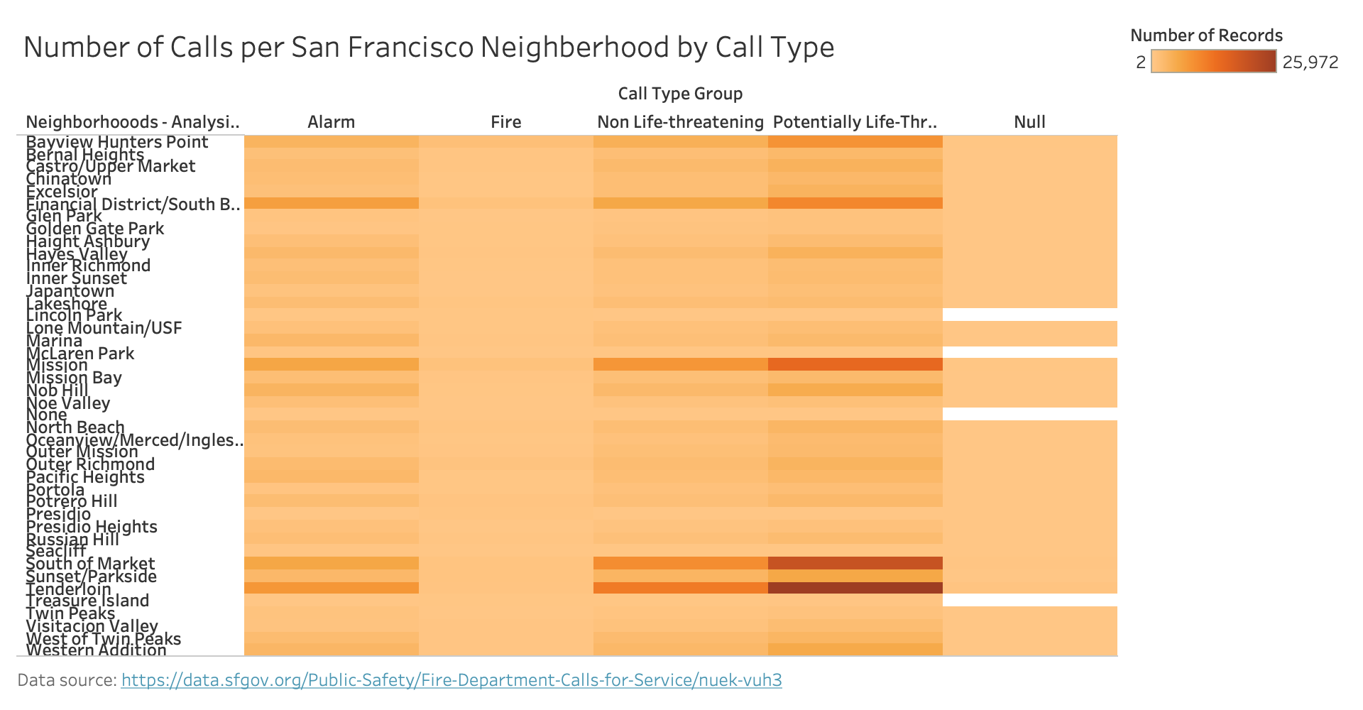
This visualization adds to the overall theme of comparing the response time of the SF Fire Department between San Francisco neighberhoods. The data presented in the visualization is the number of calls from each neighberhood in the dataset. These calls are seperatd by call type to show what services each neighborhood calls the SF Fire Department for most frequently. The fire departments response time for a neighborhood may be corellated with how many calls the fire department recieves from that neighborhood, so this visualization will help answer the question and provide context for why neighborhoods receive different response times.
Data Wrangling
This visualization uses the FireDepartmentCallsSelected.csv data which filtered the original dataset down to calls made in San Francisco in 2019. I further created a sum of the number of rows for each neighborhood and call type group. This sum is represented by the color in the heatmap.
Planned Interactivity
On mouse over of a section of the heatmap, a details on demand table will appear that shows the call type group, neighberhood name, and exact value for the number of calls made for that neighborhood and call type. In addition, when a section of the heatmap is selected, the corresponding section will be highlighted on the response time heatmap.
Feedback
Several of my peers gave me feedback about the null column in my heatmap. The feedback said that I should either get rid of the null column, or standarize the use of a null column with the other heatmap visualization in my group. After consulting with Kai, I decided to get rid of the null column in my final visualization, becasue it was very few outlier columns that were missing a call type group. Another feedback I recieved was to right allign the name of the neighberhoods so they would be directly next to the data which they are labeling. I did this in my final visualization and it makes it more clear which neighberhood the data is for. Finally, I recieved the feedback to further data wrangle so that I actually visualize the number of calls and not just the number of records. I did this data wrangling in Tableau and it significantly changed my data and made the visualization more accurate because now I am actually visualizing the number of calls.