Prototype 2
Artist: Kai Middlebrook
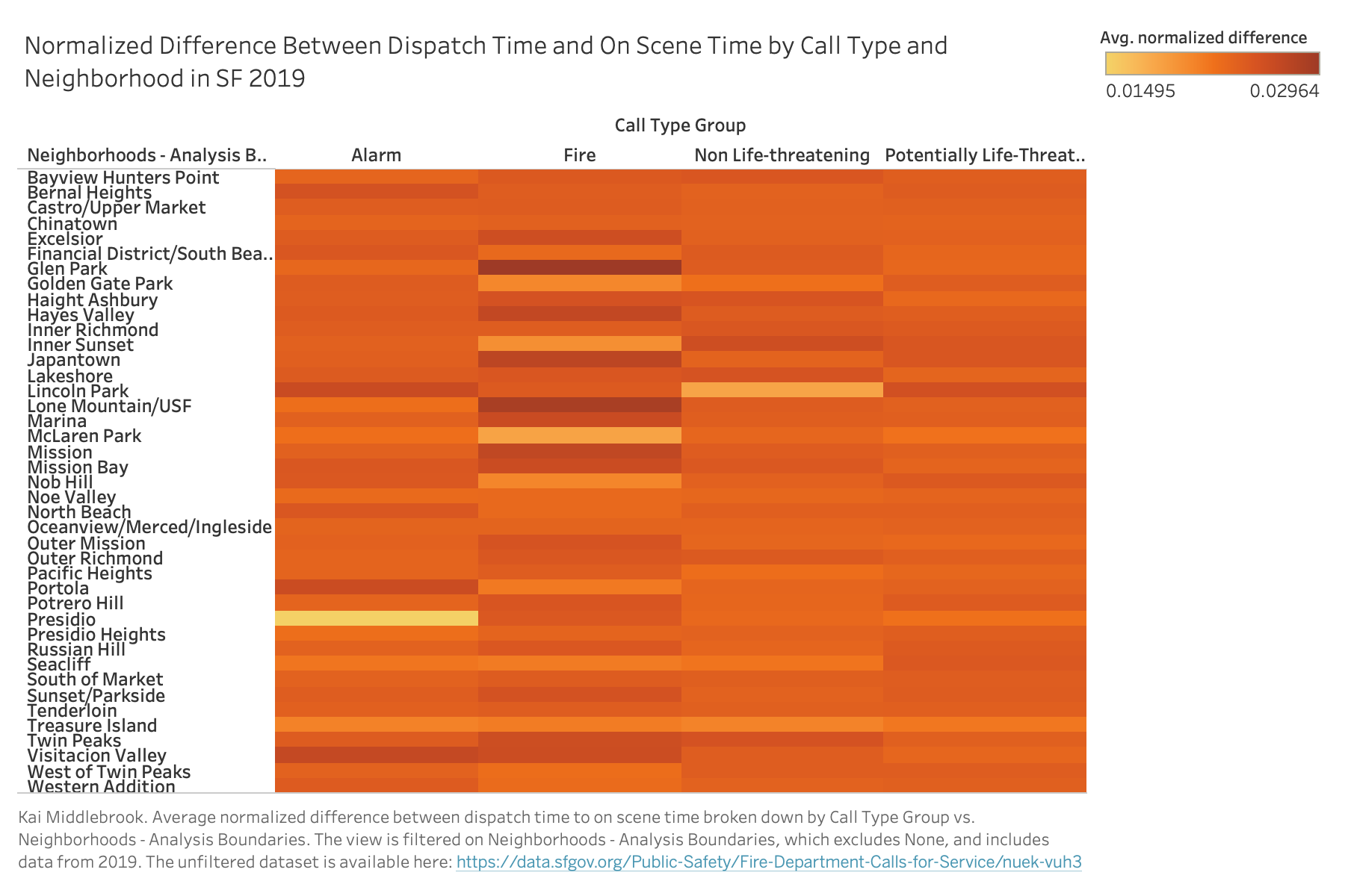
This prototype aligns with the theme of assessing the response time by neighborhoods of the SF Fire Department. The heatmap displays the average normalized difference between the dispatch time and on scene time. The visualization indicates that units on scene time for calls related to fire in neighborhoods such as Glen Park and Lone Mountain/USF have the largest average normalized difference. In other words, if there is a fire in either of these neighborhoods you can expect fire units to arrive later than the average on scene time. A number of factors may influence the on scene time such as the distance between an available fire station and the call location, accessibility of the location, etc. Both of these neighborhoods are very compact and located on or near hills, which may be the reason for long on scene time wait times.
Data Wrangling
This data was created on top of our dataset ( FireDepartmentCallsSelected.csv ). This new dataset excludes all rows with missing data (approximately 19%). In addition, 6 new columns were added: diff_received_to_onScene, diff_dispatch_to_onScene, diff_response_to_onScene, norm_diff_received_to_onScene, norm_diff_dispatch_to_onScene norm_diff_response_to_onScene. The columns containing diff_* calculated the difference between the on scene time and a response time metric (i.e. received, dispatch, response). Then the data was filtered to exclued all rows were the on scene time was before the response time metric (approximately ~0.01%). Finally, the norm_diff_* columns were created. Each of these columns contains the normalized difference between on scene time and the respective response metric. The dataset can be found here: Filtered and Normalized Fire Data. The code to reproduce this dataset is available as a jupyter notebook: Filtered and Normalized Fire Data Notebook.
Planned Interactivity
When the mouse hovers over a cross-section of the heatmap, the user will see a nice table of 3 values: neighborhood, call type group, and the average normalized difference between dispatch time and on scene time.
Peer Feedback
After reading the peer feedback, I will revise the following elements for the final visualizations:
Improving interpretability. Original I though it would be help to normalize the wait time for each call group to make comparing across groups more equal. However, this did not have the effect I had intended. Not being able to interperte the scale in terms of time was confusing. In the final version, I will simply take the average values for each call group and neighborhood.
Identifying individual cells in the heatmap. Another issue viewers had was identifying boundries between cells. To fix this, I will add outlines to each cell and a tooltip.