Visualizations
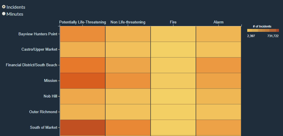
Neighborhooods vs. call type group heatmap
        Heatmap represents Neighborhooods vs. Call Type Group.
        Color shows sum of number of incidents by each call type group. Response time by minutes and number of incidents are shown on tooltips.
        The Call Type Group filter keeps all not null values. The Neighborhooods filter keeps 10 of 42 members sorted by alphabet.
        Data acquired from "Fire Department Calls for Service" from https://data.sfgov.org/.
        Elizaveta Ozerova
Data Encoding
This data represents points from 2015 onward. The heatmap shows top 10 neighborhood values. All null values were removed. The respose time in minutes was counted using Tableau formula: DATEDIFF('minute',[Received DtTm],[Dispatch DtTm]). It gets the different between Received time and Dispatch time in minutes.s The data was downloaded from Tableau prototype implementation and can be found here.
Instructions
The heatmap includes two numerical data points that should be known precisely (minutes and number of incidents). The interactivity allows us to show the number of incidents and the response time in minutes for each cell. Also it allows to see colored heatmap for both number of incidents or response time in minutes. You can switch between two modes using the radio button. Interactivity example:
Analysis
From the heatmap we can see which neighborhoods get the slowest and the fastest response times and how it correlates with number of incidents in a particular neighborhood. For example, Tenderloin has a lot of "Potentially Life-Threatening incidents" and the response time is fast, though for Castro/Upper Market neighborhood we can see that the amount of "Fire" incidents is very low, while the response time is very high. From such examples we can make a conclusion that there may be a possible correlation between response time and number of incidents. The more incidents happens in a particular area, the faster this area is being processed.
Inspirations
Thanks Sophie Engle for code examples. Heatmap interactive code example Basic heatmap code example Basic heatmap code example 2 Continuous Legend How to create a continuous colour range legend using D3 and d3fc Interactivity examples
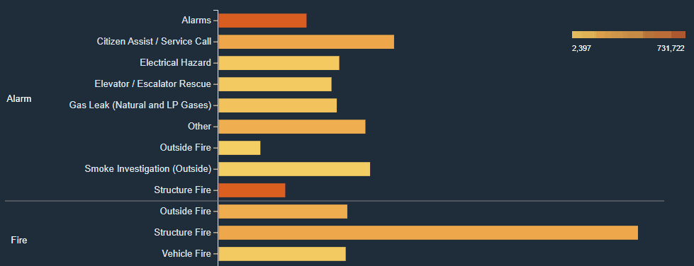
Response process time for each call type barchart
        Barchart represents average of response process time for each Call Type broken down by Call Type Group.
        Color shows sum of number of incidents by each call type. The Call Type Group filter keeps all not null values.
        The number of incidents is filtered by ranges from 1,500 to 731,722.
        Data acquired from "Fire Department Calls for Service" from https://data.sfgov.org/.
        Elizaveta Ozerova
Data Encoding
This data represents points from 2015 onward. The bar chart shows values where the amount of alarms is bigger than 1500. All null values were removed. The data was downloaded from Tableau prototype implementation and can be found here.
Instructions
The interactivity for the bar chart allows us to draw a line for each bar to compare different events and see response time in minutes for each bar. Interactivity example:
Analysis
Using the barchart we can learn about response time for each call type in details. We can learn that "Structure fire" takes 10 minutes in average to process, while other fires take no more than 5 minutes. If we were to have more data on how the fire department prepares for each call, we could assess whether the fire departments need to facilitate processes for structure fires. It's also important to take into account that call types may be processed twice, meaning that the response time between answering to a structure fire in an "alarm" call type group and answering to a structure fire in the "fire" call type group may be the same call, and it would make sense for the call to be an alarm call first, and a fire call second, while having the same initial dispatch time. Using this information we may write some recommendations for training for "Structure fire" calls, or look depeer into the data to see if the calls need to be labeled more efficiently. However other variables that may be taken into account is whether all departments can respond to the same type of calls, and whether distance or traffic is a factor when dealing with these calls. We can also learn that Potentially Life-Threatening calls take between 2 and 3 minutes, while Outside Fire calls take around 1 minute of processing time. So, we can write recommendations in building a comparative analysis between Outside Fire response process and Potentially Life-Threatening response process. This analysis may show how to improve the timing for more dangerous calls. Another point to keep in mind is that outside fires do not happen very frequently, and would be interesting to analyze whether they are date specific related (for example 4th of July), which would make the fire departments prepared for outside fires in specific outside areas (for example: barbeque areas in parks).
Inspirations
Thanks Sophie Engle for code examples. Simple d3.js bar chart Simple bar graph in v4 Building Interactive Bar Charts with JavaScript Continuous Legend How to create a continuous colour range legend using D3 and d3fc Interactivity examples