Prototypes
Goal
The visualizations on this page are focused on different call types and the reaction time in different neighborhoods.
Wrangling
This data represents points from 2015 onward. More information about the data can be found here. The heatmap shows top 10 neighborhood values and the bar chart shows values where the amount of alarms is bigger than 1500. All null values in both prototypes were removed.
Neighborhooods vs. call type group heatmap prototype
Created with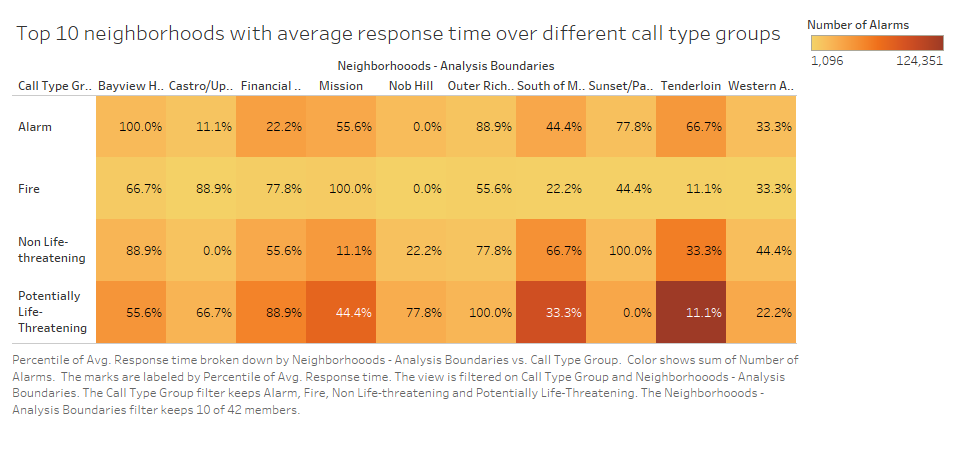
Peer Feedback
|
|
|
|---|---|
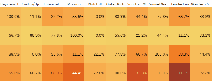
| Hide the exact percentage though, and only show it in interactivity. | Showed minutes and # of incidents with "details on demand". |
| It also threw me off what the encoding at 0% and 100% meant. | Changed to show minutes, not percents. |
| Data-ink ratio very high. | Reduced by showing more with interactivity. |
| Changing orientation may help to show more data better. | Orientation was changed, x and y switched. |
| Sorting. | Neighborhooods were sorted by alphabet. |
Theme Analysis
The heatmap is intended to show the percentage of overall difference in response time by neighborhoods. The top 10 neighborhoods are shown. From this chart we can see the slowest and the fastest response time for each group of incident by neighborhoods. The heatmap also shows the amount of incidents in each group. Using this heatmap we can make the analysis of connection between the response time and the amount of incidents.
Planned Interactivity
The heatmap includes two numerical data points that should be known precisely (percentage and number of alarms). The interactivity will allow us to show the number of incidents and the percentage of response time for each cell. Example:
Gif animation was done using Tableau.
Response process time for each call type barchart prototype
Created with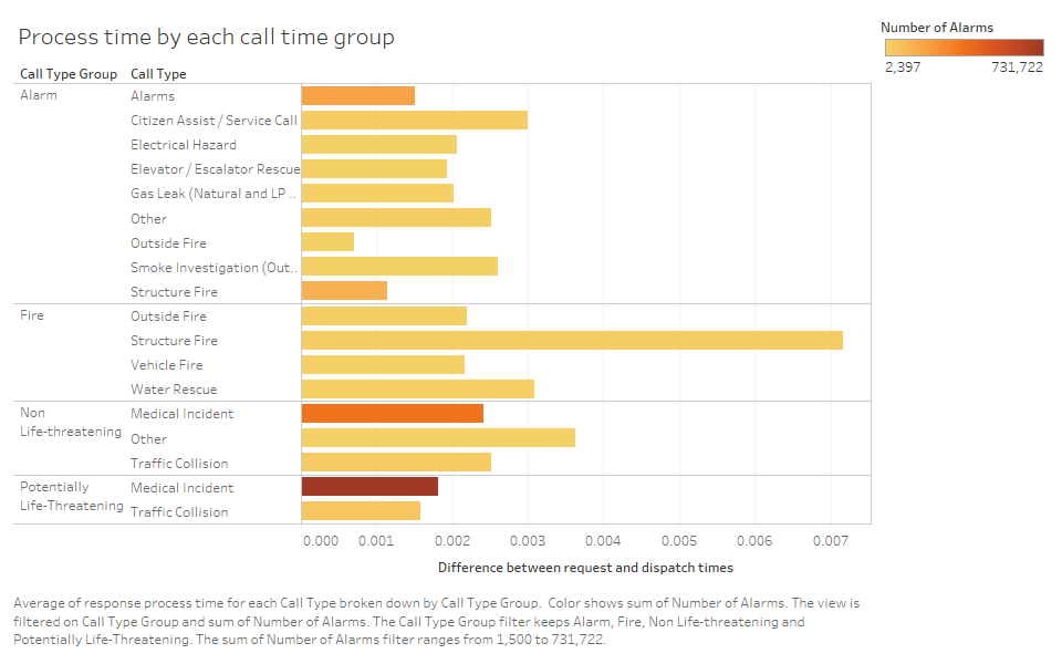
Peer Feedback
Haven't had any suggestions in peer feedback for bar chart prototype.
Theme Analysis
The bar chart shows the whole process time (request time - dispatch
time) in minutes by each call type. Each call type shows to which
group type it belongs. The color shows the amount of incidents. This
chart is made to support the heatmap in showing deeper analysis of
incidents by types.
Overall both prototypes are intended to help in analyzing the time of
the whole process for each incident and neighborhood.
Planned Interactivity
The interactivity for the bar chart will allow us to draw a line for each bar to compare different events and see a number of alarms for each bar. Example:
From: Interactivity Lab