Prototypes
Goal
The purpose of this prototype is to visualize the number of alarms and different number of station area in different neighborhoods and zipcodes of San Francisco respectively based on Priority or Call Type Group respectively.
Wrangling
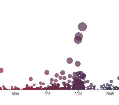
For this prototype, the dataset was reduced to the last 5 years and records with null values from Neighborhoods ,Priority as well as Call Type Group were removed. The graphs are sorted graph by number of alarms.
Tableau Prototype
Created withPrototype 1

Theme Analysis
This prototype tells you about the number of alarms in different areas of San Francisco. It shows that the highest number of calls are coming from Tenderloin and most of these calls are prioritized as Emergency. Many of these calls are for life threatening incidents. The least amount of calls received are from Presidio and Treasure Island.
Planned Interactivity
The final visualization will have an animation that shows details in tooltip and highlights the graph with respect to color class priority. It might also show maximum calls and call type. This is similar kind of interactivity planned to use.
Peer Feedback
|
|
|
|---|---|
| Remove too many priority and keep it more self explanatory. | Reduced priority and encoded it with size. |
| Not sure if it is scatter plot or bar chart. | Changed to bar chart. |
| Change priority in color encoding to something else. | Changed to Call Date filtered by Years. |
| Changing orientation may help to show more data better. | Orientation was changed, x and y switched. |
| Sorting. | Based on highest number of alarms. |
Prototype 2
Theme Analysis
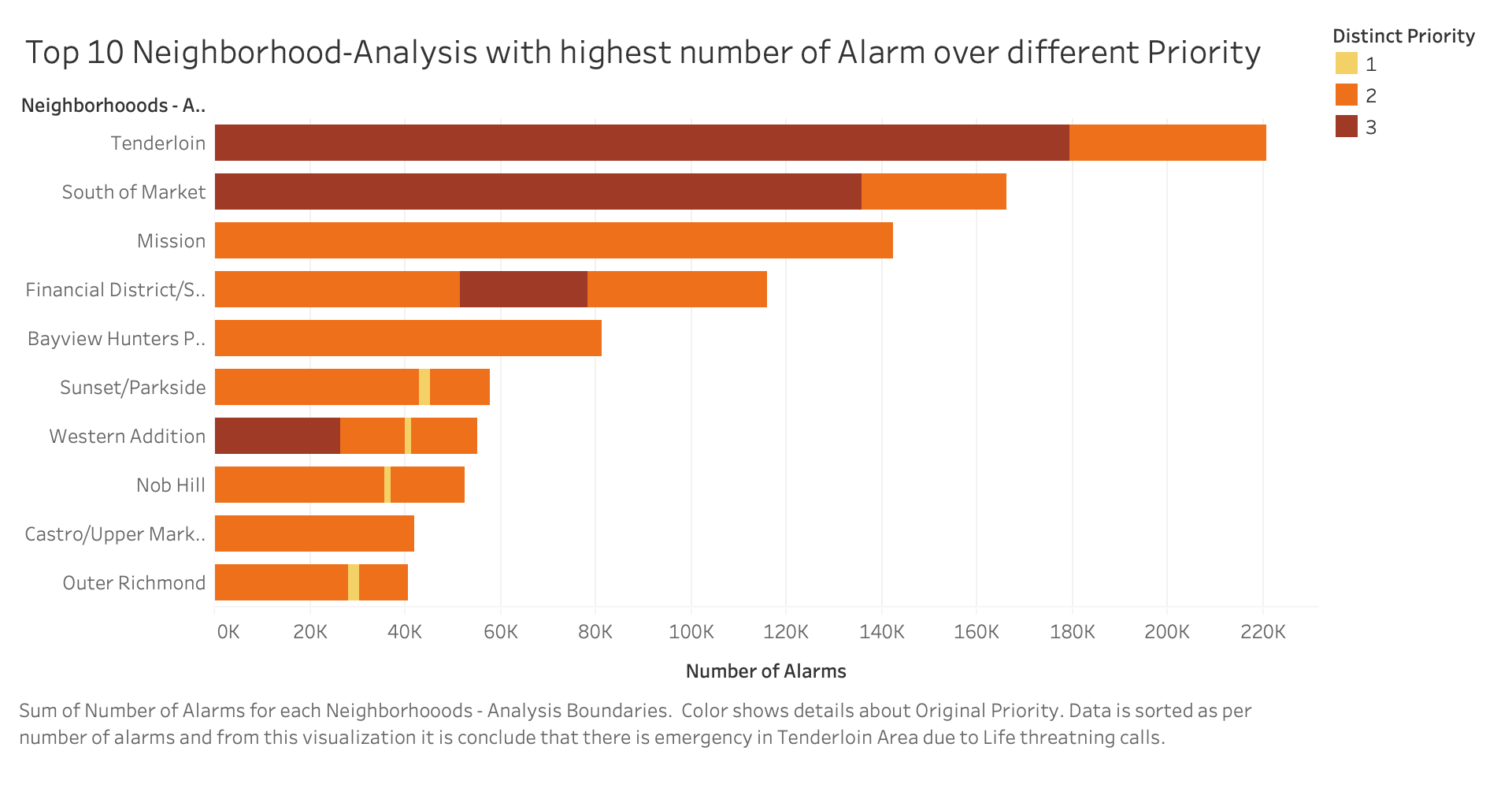
This prototype is an alternative for prototype 1. It shows Top 10 Neighborhoods in SF with respect to Number of alarms which are color encoded over priority. It shows that Tenderloin has highest Number of alarm of Priority 3 which is for Emergency.
Planned Interactivity
The final visualization will have following interactivity that will animate highlighting a bar amd showing detail on demand on tooltip.

From: https://observablehq.com/@d3/bar-chart-race-explained
Peer Feedback
No Feedback provided for this chart
Prototype 3
Theme Analysis
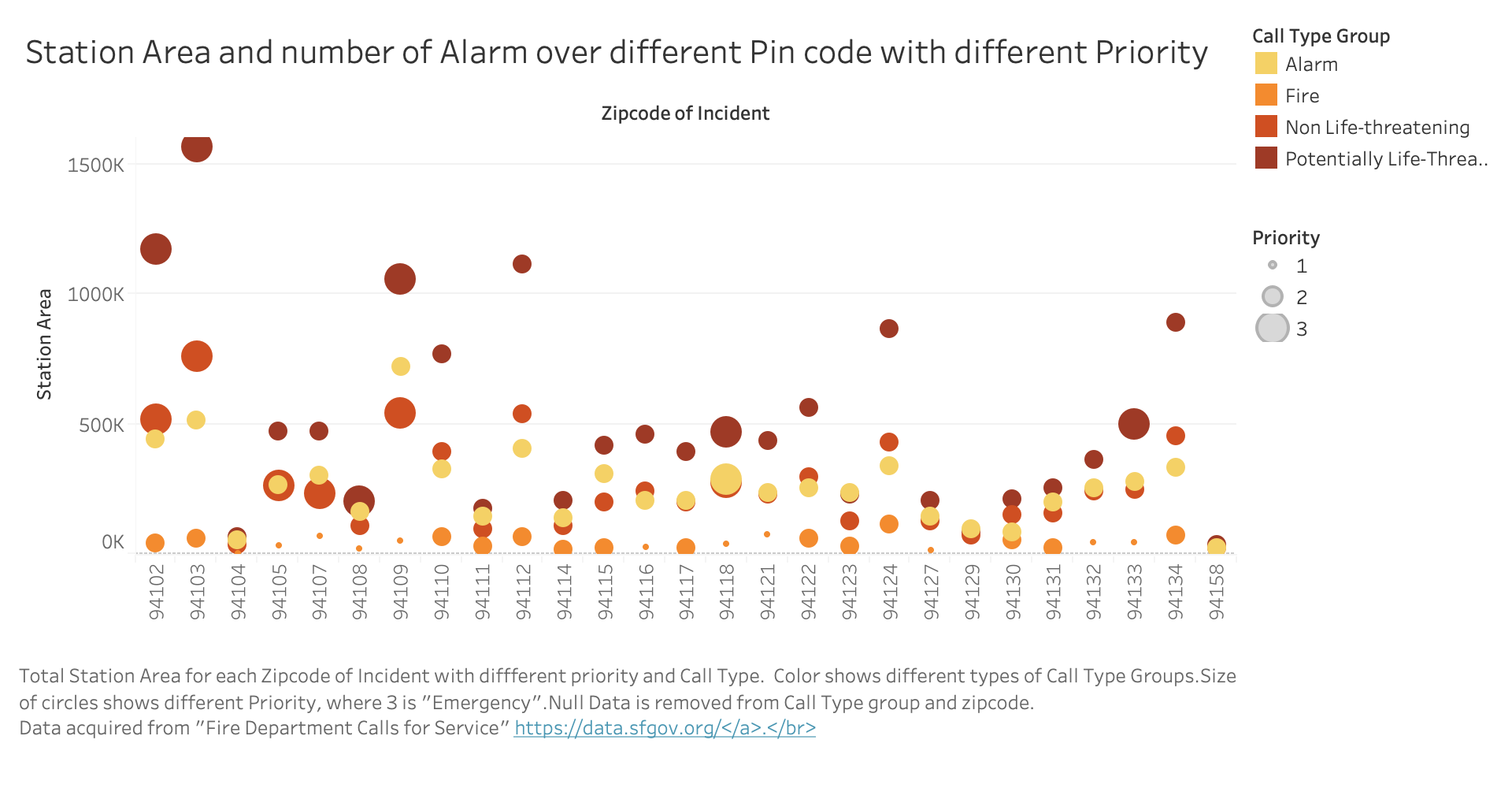
This prototype shows different alarms encoded over color and prioritized over size (where 3 is Emergency). It shows Station Area over different zip codes. It shows that 94110 has highest station area but least Priority. It relates with first prototype which shows different Neighborhoods of SF.
Planned Interactivity
The final visualization will have an animation that shows details in tooltip and highlights the graph with respect to color class priority. It might also show maximum calls and call type. This is similar kind of interactivity planned to use.
Peer Feedback
This chart is preferred over prototype 1 .