Visualization Prototypes
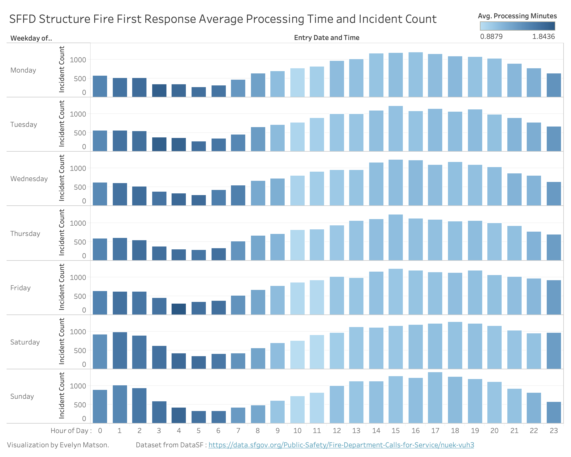
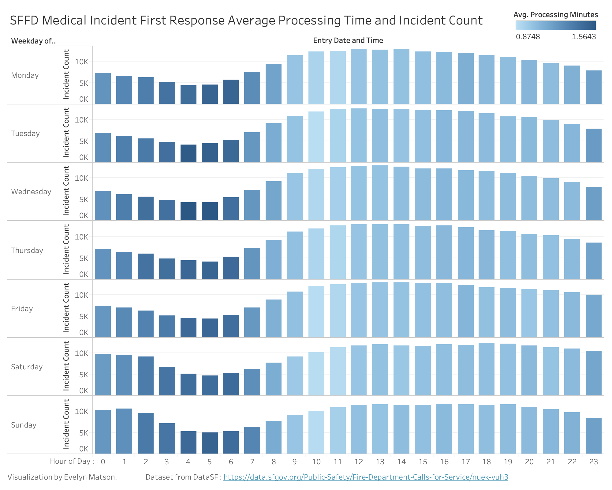
In my visualizations, I chose to focus on 'preparation time': how long it takes fire department units to prepare for a call, or the difference between when a call is sent from a 911 dispatcher (dispatch time) and when the unit leaves the station (response time). I focus on two of the most common types of incidents, medical and structure fires, and on only the preparation time for the first response vehicle to any given call.
For each, I separate the data by weekday and hour of the day, then calculate the average preparation time for all matching responses. Average preparation time is encoded as color, and the number of matching responses is encoded as the height of the bar.
So, higher bars represent higher call volumes at a given time on a given weekday. Darker bars represent a longer preparation time during that same interval.
(Prototypes created in Tableau)
Relevance to Overall Theme
Examining the preparation time at different times during the week shows discrepancies in how efficiently the system is able to respond to different incidents. The visualizations show that the fire department is more or less prepared to send help to where it's needed depending on what time of day and what day of the week it is. Many of these times when preparation times are higher happen during periods of the week when fewer incidents take place, but some have high rates of incidents AND high average preparation time (such as medical incidents at 2AM on Saturday and Sunday). This demonstrates times when the fire department is less effective for the people who need it then.
Peer Feedback (Updated)
Peer feedback was very helpful! Based on suggestions from classmates, I made the following changes:
- I changed the color scale used between the different visualizations, to differentiate them.
- I used color schemes for each visualization that remind people of the type of incident they focus on.
- I added a tooltip for data-on-demand interactivity so users can see the raw values being visualized.
Planned Interactivity
My primary interactivity I plan to implement will be data-on-demand in the form of a tooltip. Hovering over any bar will show the specific incident count and average preparation time for that day and hour.
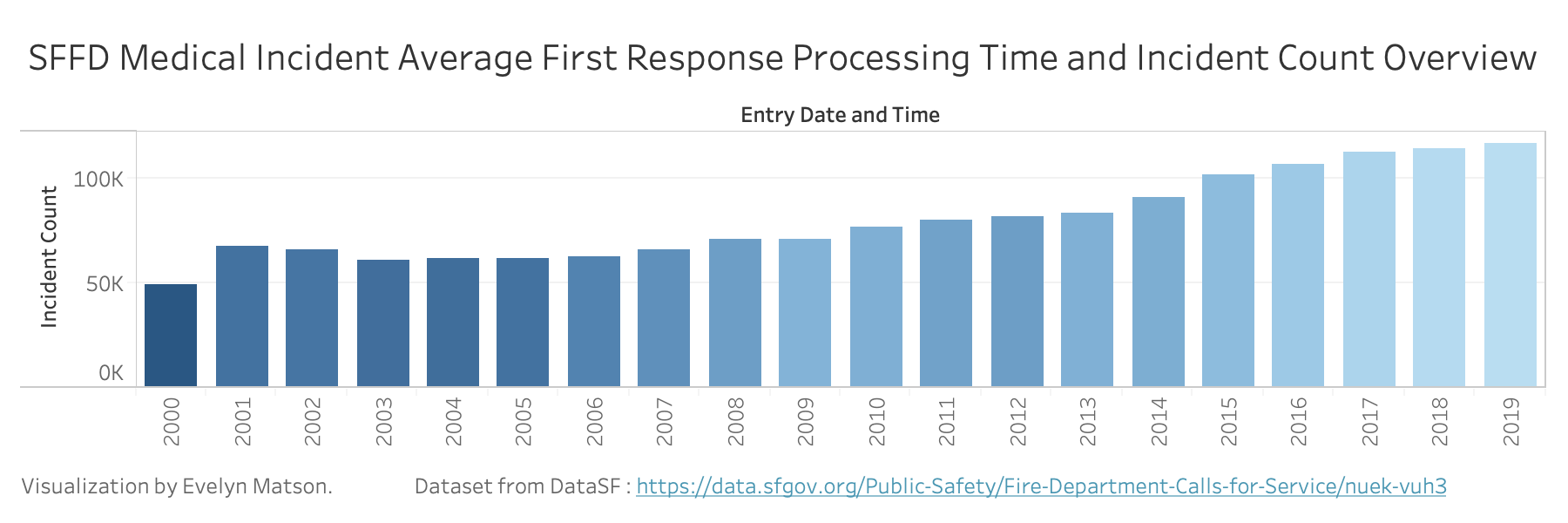
I will also add an overview below each visualization that shows how the overall average has changed overtime. Brushing on overview will change which years are displayed on the main visualization.
I will also add checkboxes to select which neighborhoods are displayed, so users can explore the data specific to the areas they care most about.
Update: I did not implement this neighborhood selection interactivity, because that would have resulted in too large of a dataset. I had to prioritize smooth interaction and fast loading times instead.
Data Wrangling
I did all data wrangling in Tableau after simply importing the whole dataset. I calculated preparation time as the call response time minus the call dispatch time.
For both visualizations, I also did the following filtering:
- Remove responses with "unit sequence" greater than 1, to show only the first responses, not any subsequent responses to the same call.
- Remove responses from years with incomplete data (2000 and 2020)
- Remove responses with call types other than the relevant one (medical incident or structure fire).
- Remove responses with unusually long processing times (above an hour). These were rare and I considered them outliers.