Phototype
Visualize the “ Presidental Election”
Is there a visible voting patterns of US Presidential Election from 1984 to 2016?
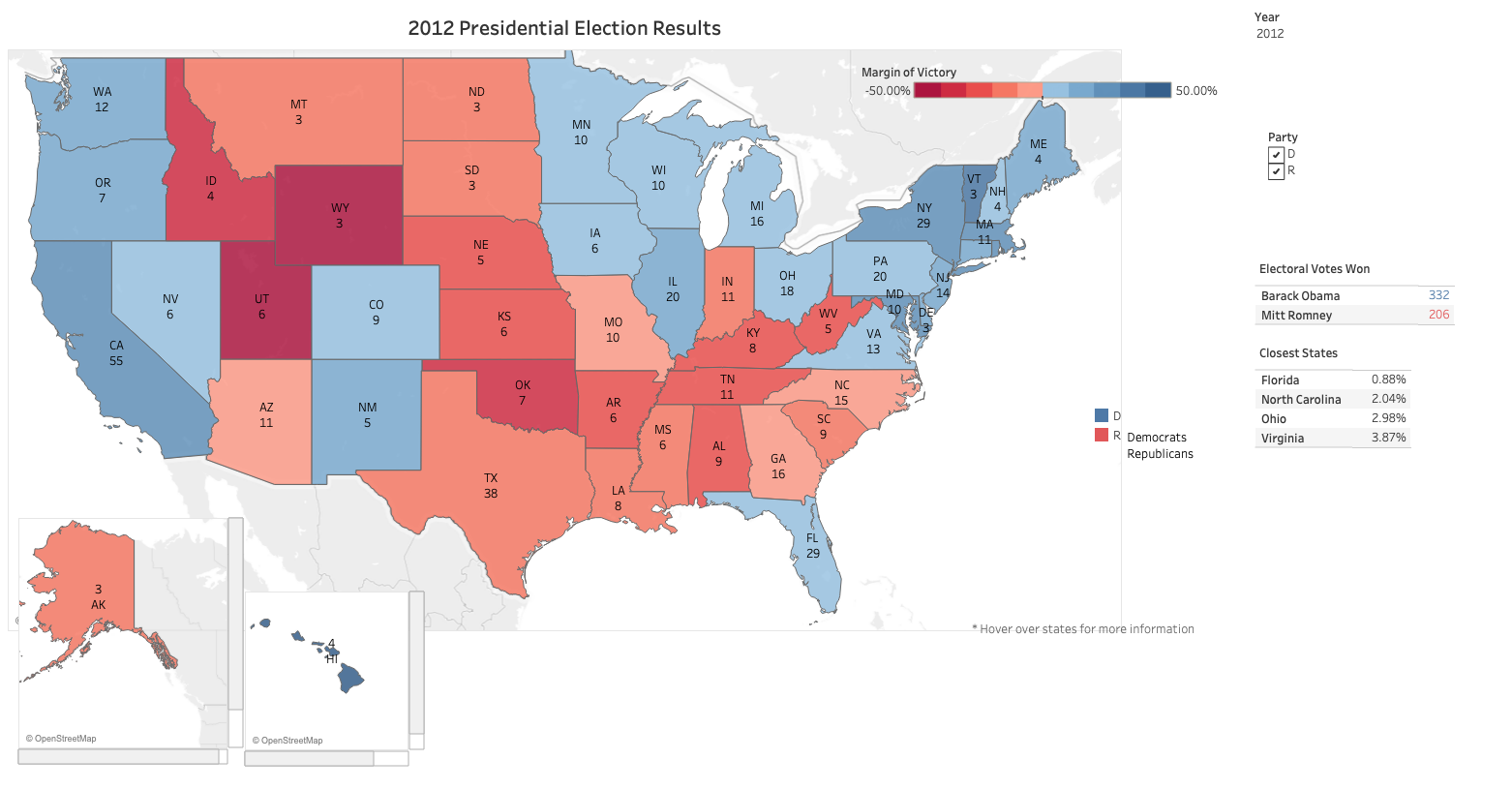
We may be can draw conclusions from the Presidential map: the same few swing states usually decide the election, the country is getting more polarized, and there is evidence of a partisan realignment.
Encoding
I built a geocoded electoral choropleth map in Tableau, using red for Republican states and blue for Democratic states. The depth of color also represents the margin of victory, the darker color means greater margin of victory.
Time-series line chart
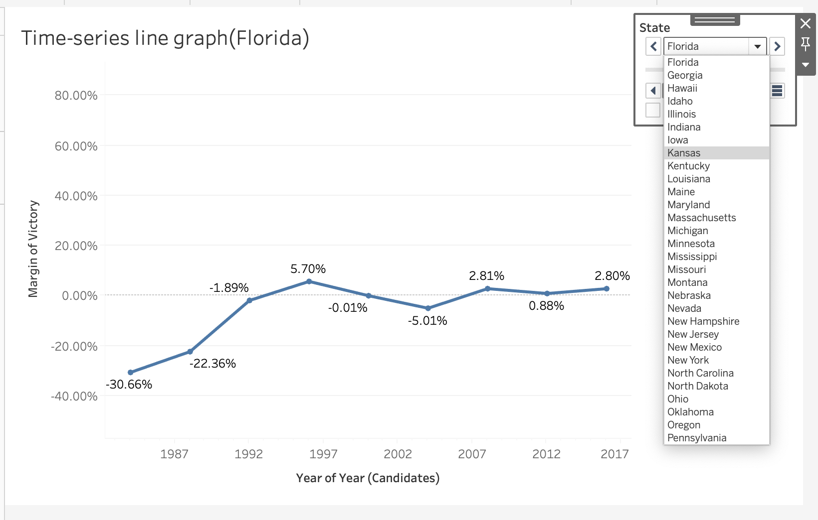
In below Diagram, Florida always swithes their seat over year.