The purpose of this prototype was simply to ensure the dataset could be loaded and visualized.
Beta prototype
Question
The question I am trying to answer with this prototype is: Where are the most dangerous and the safest places in San Francisco to park your car?
Answer
Using this prototype, I can say that the most dangerous part of San Francisco to park your car is in the northeastern part of the city. This is because
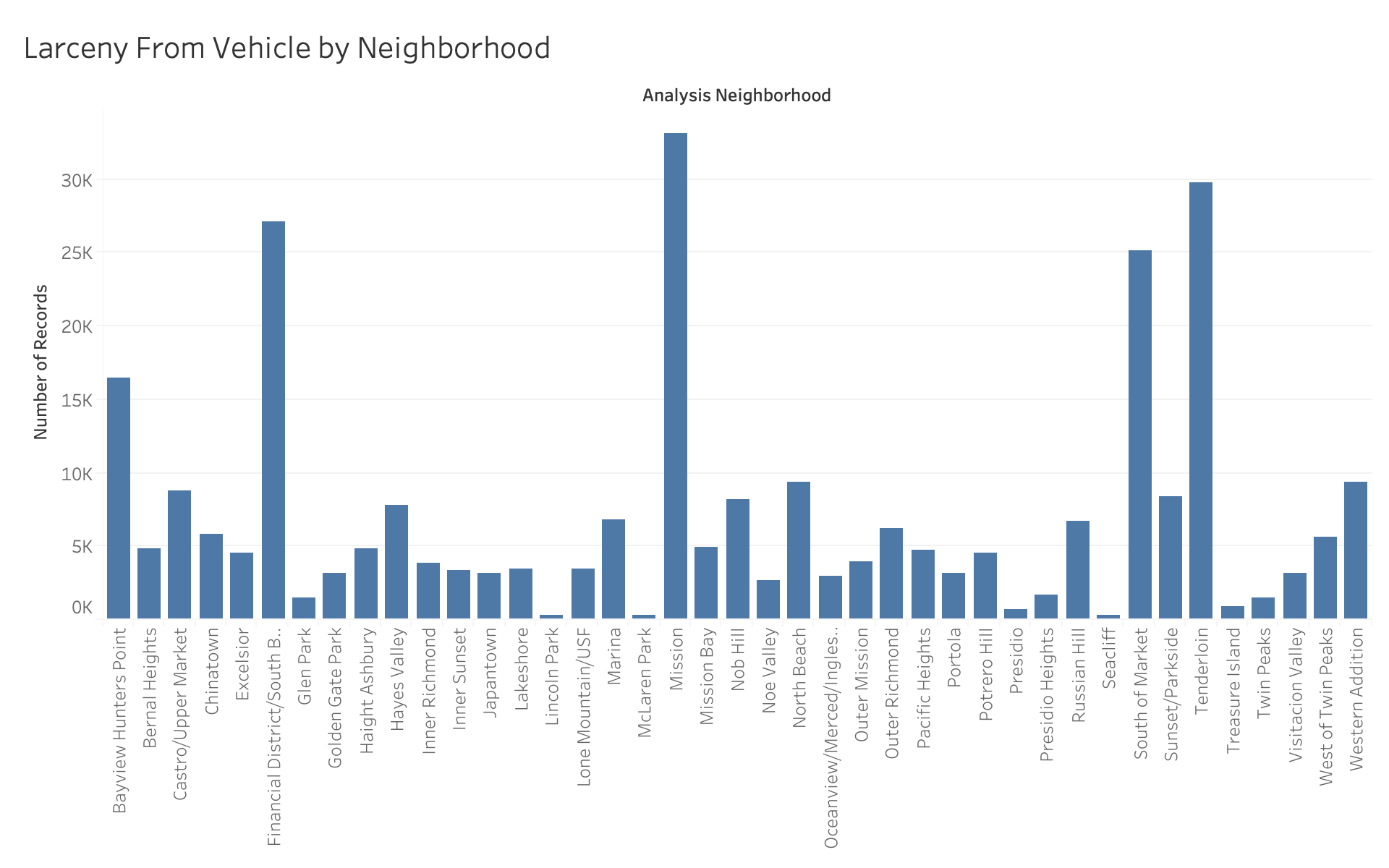
this part of the city has the highest concentration of motor vehicle theft and larceny from vehicle.
Encoding
Each circle on the map encodes one police incident of vehicle crime. The position of the circle on the map is encoding the latitude and longitude of where this
incident occured. The color of the circle is encoding the incident type. Red is given to motor vehicle thefts because it is the more extreme and costly crime,
while orange is given to larceny from vehicle because it is less extreme and usually less costly.
Planned Interactivity
For this visualization, I plan to implement details on demand interactivity. When the mouse hovers over a circle, a tool tip will appear which will give more
information about that incident. The tool tip table will include the neighborhood, the exact time and date, and the description of the incident. When the mouse
hovers over a neighborhood on the basemap, the name of the neighborhood will be shown. There will also be brushing interactivity so that when the mouse hovers over
an incident, the incidents of the same type will be more prominent while the incidents of the different type will fade to the background. Finally, I will include
interactivity which links this map visualization to a second visualization that will show the trends over time in vehicle crimes in that neighborhood. When the mouse
hovers over an incident in this visualization, the bar corresponding to the same neighborhood in the bar chart visualization will be highlighted.
Feedback
Asynchronous Peer Feedback
I recieved feedback on my beta release prototype that the background color on the map was too bright. I changed my visualization based on this feedback from the
bright blue background color to a white background color. This is also a better use of gestalt principles by clearly showing the data in the foreground on a white
background. I recieved feedback on my design and aesthetics that said to update my website theme from the default template to something more aesthetically pleasing.
I updated my website design based on this feedback to include better looking colors. I recieved feedback that the circles I used to represent reports were small and
hard to see. I changed the visualization based on this feedback and increased the radius of the circles.
Live Instructor Feedback
I recieved feedback from my instructor Sophie Engle to include the streets of San Francisco in the map visualization to make it easier to read the map. I updated
my visualization based on this feedback and added the streets to the map. I also recieved a recommendation for a supplemental visualization of a heatmap to show
time data to go along with the geospatial data of the map visualization. I took this feedback and implemented a heatmap which shows the number of incidents of car
break ins based on the day and time.
I am a computer scientist from San Francisco with an interest in front-end development and game design. I enjoy writing songs, playing basketball, and baking.