Yearly Average Calls Per Neighborhood (2013-2019)
Peer Feedback
I received suggestions to use average calls per year instead of totals as it would give a better look at how neighborhoods differ each year. Also, I received some feedback on what kind of interactivity could help provide better insight. So I implemented sorting (descending) based on call type group to sort the heatmap cells in order for users to see which neighborhoods have the highest average calls per year in each category. I also implemented details on demand when hovering over a datapoint to see the actual number of calls for that call type group.
Data Wrangling
Data was wrangled first prior to download, through the editor provided on the data provider's website. There, we filtered the data for calls since 2013. Then in Tableau, we filtered out any rows that did not have a valid Call Type Group value;Visualizations
This visualization shows the number of calls for each Call Type Group in each neighborhood. The four valid Call Type Groups are:
- Alarm
- Fire
- Non Life-Threatening
- Potentially Life-Threatening
- Tenderloin
- South of Market
- Mission
- Financial District/South Beach
- Bayview Hunter's Point

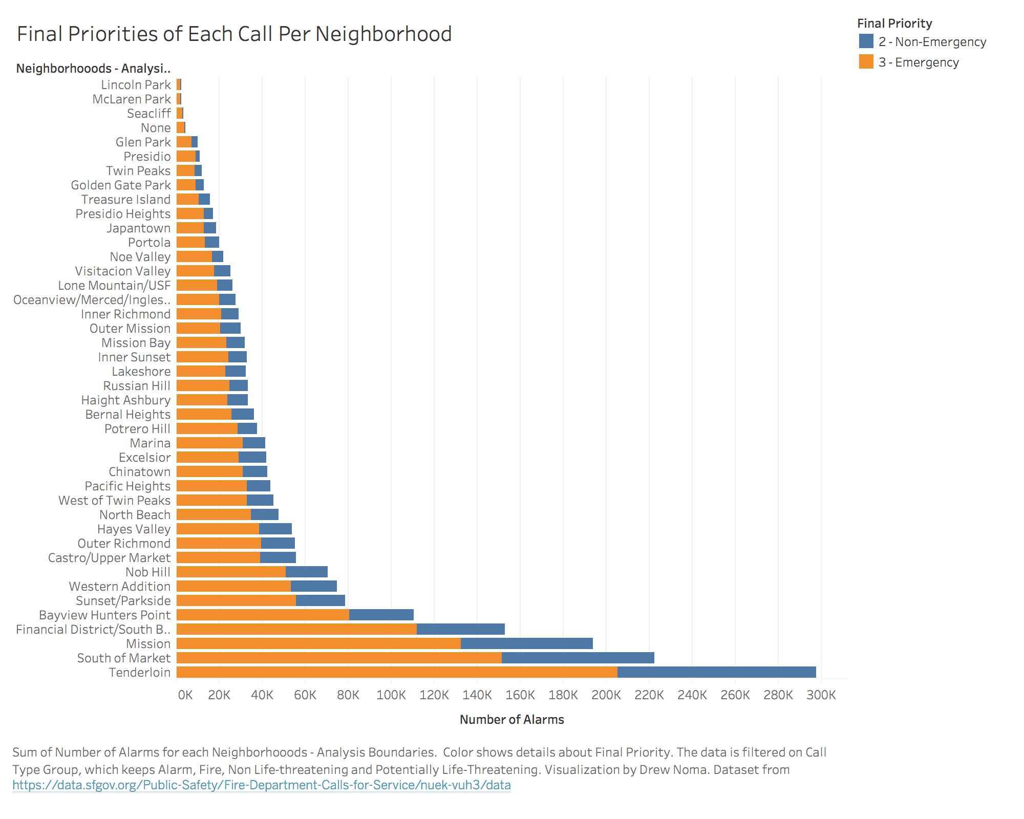
To give more context, another visualization is included to show the total number of calls and the Final Priorities of the calls from each neighborhood. The bars of each stack are encoded by color for Final Priority. The Final Priority is determined by the Fire Departments to say whether or not the call was actually an emergency or not. While people may report an emergency when calling in it is up to the Fire Departments to determine if the call is deemed an emergency or not.
Future Interactivity
Future interactivity for these visualizations as they stand today could be brushing for each each neighborhood to order to highlight the interesting points of interest. Visualizations are subject to change.