Yearly Average Calls Per Neighborhood (2013-2019)
Data Wrangling
I used the filter function on the SF Data website to filter on calls from received during 2019 (received after 1/1/2019 12 AM, received before 1/1/2020 12 AM) where the call group type was FIRE, and the final priority was 3 (emergency). I used Tableau to extract the call date (MM/DD) from the Received Date column and used the DATEDIFF function to calculate the length (subtracting the call received time from the time the unit was available again). I created the separate neighborhood bubble charts using the Tableau filter function to ensure the same color scheme across all subgraphs.
Motivation
The SF Fire Dataset has a column Call Type Group with potential values "Fire, Alarm, Potential Life Threatening and Non Life Threatening". When I explored the dataset, I found that "Potential Life Threatening" and "Non Life Threatening" mostly had to do with medical calls. As Nick and Drew focused on the other values of Call Type Group, I decided to stick with the "fire" group, since those can still have a Final Call Priority of 3, emergency. I used 2019 data only to create a more manageable dataset size: I'm more interested in comparing across neighborhood, type, and time of day, as opposed to exploring change in fire calls over multiple years. Neighborhoods with more fire activity do tend to have more medical activity as well, but the overlap is not precise.

So this stacked bar chart shows an overview of the fire calls that different neighborhoods receive. We can clearly see that some neighborhoods (Bayview Hunters Point, McLaren Park) have more calls than other neighborhoods (Japantown, Twin Peaks), and that the types of calls vary across neighborhoods. For example, while Outside Fires and Structure Fires appear across all neighborhoods, Water Rescue does not. This presumably has to do with geography, since not all neighborhoods are on the water.
The following are bubble charts, where time of day (encoded as hour in 24hr time) is used as the Y-axis, time of year is used on the X-axis, call type is encoded as bubble color, and length of response (in minutes) is encoded as bubble size.
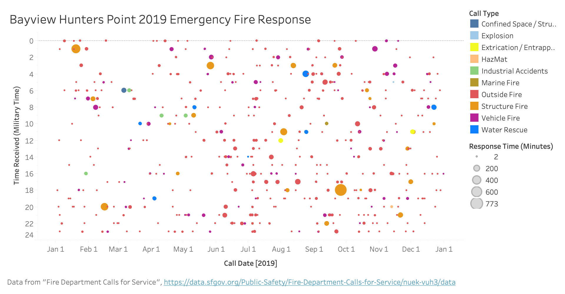
Bayview Hungers Point has the most fire calls (if we compare with Drew's visualization, we can see that that neighborhood has a lot of other-coded calls as well) and this is reflected in the bubble chart. These are mostly outside and vehicle fires with fairly short response times; structural fires take longer, probably because the item on fire is larger. Through the summer and the second half of the year, calls are evenly scattered through the day. Interestingly, from January through March, fire calls seem to mostly take place at night, and avoid the "working hours" of the day.
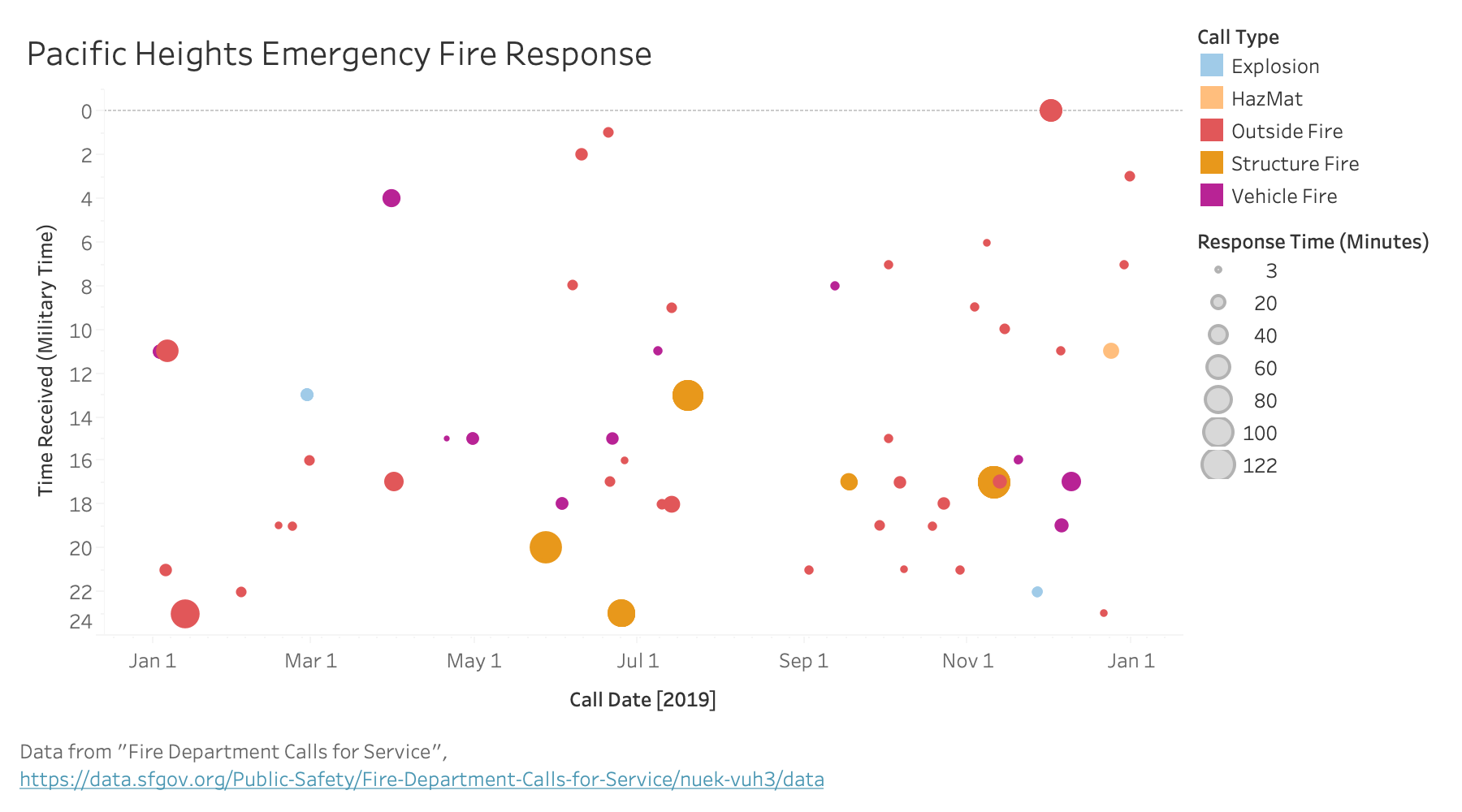
This neighborhood has much less fire call activity; I chose this neighborhood in particular because Nick focused on it as well). The bubble chart accordingly shows much fewer calls, though what calls there are tend to be more serious. Fire calls in this neighborhood happen generally during the afternoon and night.

As Nick's visualizations show, the Tenderloin has a lot of fire department activity. This is also reflected in that neighborhood's bubble chart, which looks more like the Bayview Hunters Point than Pacific Heights. However, even though this neighborhood has the most medical calls, there are fewer fire-related calls.
Most calls are outside fires, and most of them were responded to pretty quickly. Vehicle fires similarly seem to be relatively minor (makes sense considering smaller size of vehicle). However, industrial accidents and structure fires seem to take longer, potentially over an hour, before the unit is free again. In particular this neighborhood had two larger industrial accidents in 2019, which the other neighborhoods did not.
Future Steps
I would like to add interactive functionality so that when you mouse over a bubble, a tooltip comes up with more information about that particular call. I think this will be a fitting complement to the way I showed calls happening both by time of day and time of year. If I had aggregated calls, then that tooltip functionality would no longer make sense.
It would also be cool if I could have a timeline slider to show more years' data, or an option to select neighborhood on one graph. I've shown multiple neighborhoods on multiple individual charts, but there are too many neighborhoods to feasibly show this way. A small multiples of bubblecharts for each neighborhood is also an option, but then the hover/tooltip functionality becomes more difficult to use, since each individual call is so small.