Bar + Pie charts
By Paul Ke
Introduction
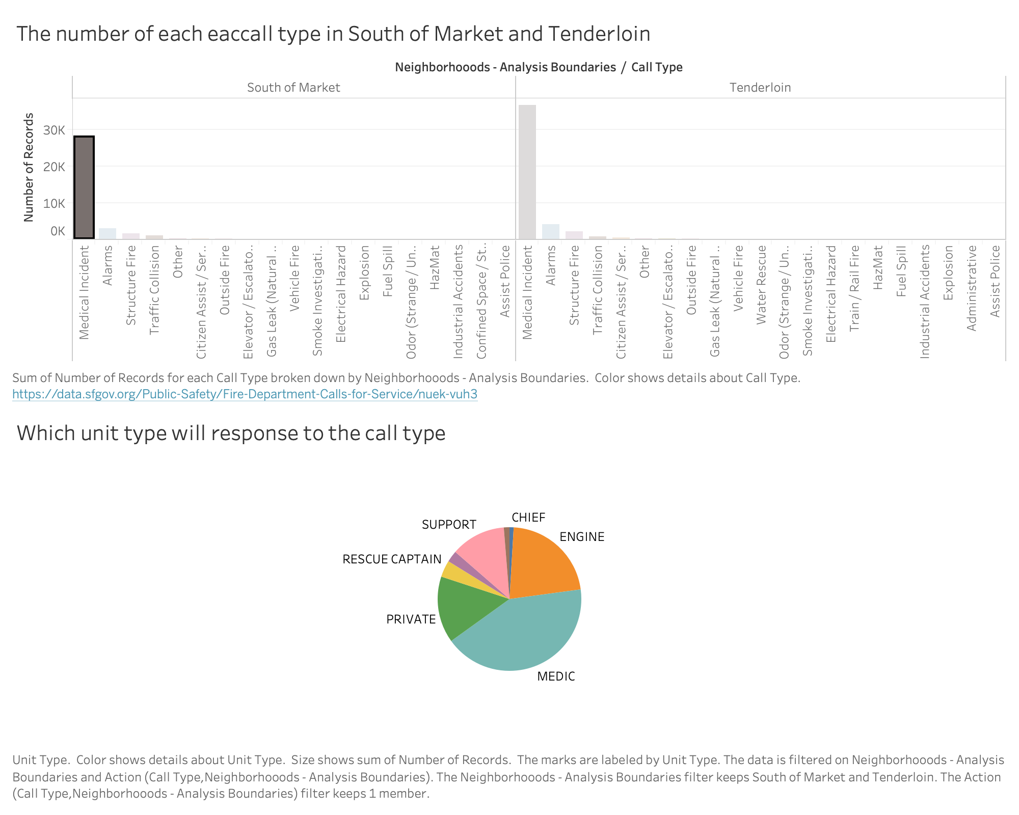
This page is like a case study, my other team member provides a general fire department information and I am going to focus on two community: South of Market and Tenderloin. The reason why I choose this two community is theses two communities has most number of records than others. I want to illustrate that how many resource is going to be use in each record and does those resources be used efficiently and rightful.
Data
- Unit Type: unit type
- Neighborhoodr: two community: Tenderloin and South of Market.
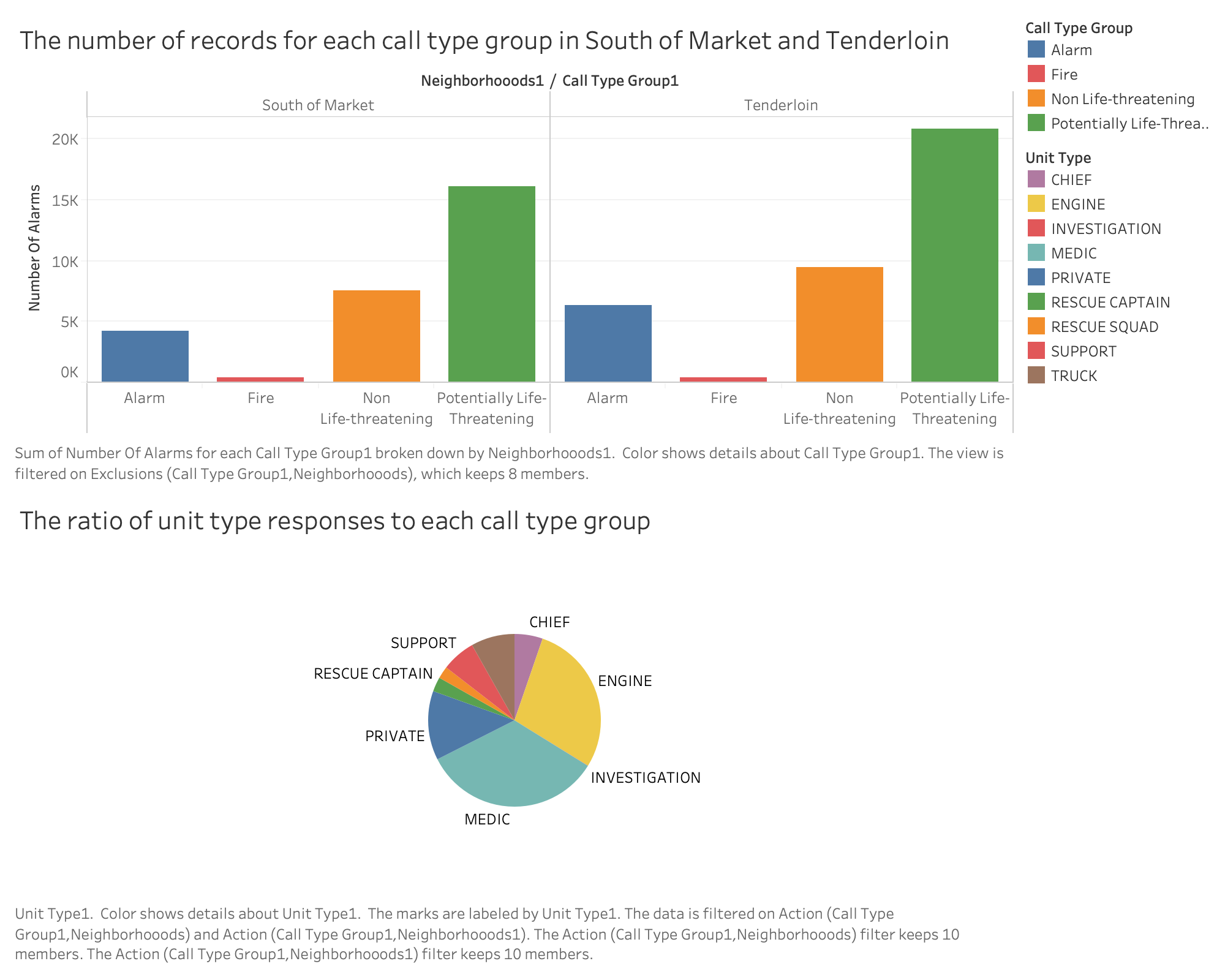
- Call Type Group: Call types are divided into four main groups: Fire, Alarm, Potential Life Threatening and Non Life Threatening.
- Number of Incidents: Count of incidents calculated by checking unique incident id's.
Wrangling
The dataset is filtered on the original website and group with the filter function by D3.js, and the range was chosen to be from January 2019 to December 2019. Also the data are grouped by incident id, call type group, unit type, and neighborhoods.
bar chart shows the number of record for each call type group in this two community, the longest bar the largest number of record for the call type group.
The pie chart displays the ratio of each unity type response to the call type group. The bigger area the larger number record for the unity type
Interpretation
In the bar chart, the color in each bar indicates the count of unique incidents,
the x-axis of bar chart is the response community name and call type group name along the year of 2019,
the y-axis of bar chart is the number of records.
In the pie chart, the ratio for each unit type responses to the call type group
Instructions
The bar chart shows that number of records for each call type group in this two community, different color represent different call type group, you can see the information in the legend. When you mouse over each bar in the bar chart, you will see the the ratio of each unit type response to each call type group by displaying in the Pie chart. Different color represent different unit type and you can see the information in the legend.
Visualizations
Here is the chart made by D3.js

Here is the chart made by Tableau
Old Prototype
Peer feedbacks
First, the original prototype include unnessay data of call type, so I replace each call type as call type group and get rid of null value.
Second, I update the data and make the density of data in new one higher than the old one
New Prototype
Connection to project themes
The visualization charts in this page demonstrate how the public resource of SFFD is be used in this two community, especially the ratio of unit type responses to each call type group bring me to think about is there any wasting of resource here. Can government cut off some unnessary unit type response to the call type group and put more source into some unit type which the operation frequency is high. Government can start to adjust the arrangement of dispatching each unit and deploy more source into some emergency and needed unit.
Inspiration
http://bl.ocks.org/lmatteis/73ce86ae3ce3332035c9c2829a94b7c1