Enrique
Data wrangling
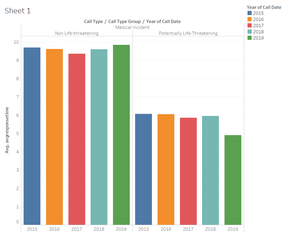
For data wrangling in this prototype we selected a five year range to see if we could find a change in the SFFD over time. This was done on the Data SF website with their data filter tool.
For this particular prototype I made an average response time using the
Prototype

Planned Interactivity
Side by Side Bar Chart
For interactivity for this bar graph I intend to use a tooltip to have the relevant information show up when hovering over the bar, and highlight the bar in either the
Stacked Bar Chart
For the stacked bar chart I would simply highlight the bar it was on and put a tooltip on it so as to wasily see the average response time, since it's harder to differentiate on a stacked bar chart.
Group Feedback
| Feedback | Corrections |
|---|---|
| The chart does not need as many colors. | Colors were reduced to two, one for each call type group. |
| Label for minutes was not clear. | Labeled the y-axis with a minute label. |
| Chart title needed to be added. | Added a chart title in the svg. |
| Data could be interpreted in months instead of years. | Data interpreted per month for the same five year period. |
D3 Implementation
Interactivity
The interactivity added to this barchart includes a tooltip when hovering over bars, a grey out of all other bars, except it's corresponding month in the second bar chart when hovering over a specific bar, and a highlight and grey out of the specific bar-chart when hovering over the legend.
Data
The data from this chart is the data divided by months for the 2015 to 2019 range of the medical call types, and they were grouped by the group types of "non life threatening" and "potentially life threateneing". The data was also adjusted for december 2019, which was giving response times in negative minutes. We may have to delve a little deeper to see if SFFD have time-travelling Response trucks, but until it's confirmed, the data has been adjusted to not include those numbers.
Interpretation
Looking at the chart there is clearly a lag in response time when the medical incident call is non-life threatening, understandably so since there is no extreme urgency to get to the call. There is a significant increase in response time when there is a life threatening medical incident. In general over the months the non life threatening response time does not vary too much, nor does it vary much for the potentially Life threatening calls, there is a diffenrece between this and the prototype, after having cleaned up a negatice response time value for the month of december 2019. Decrease in resposne time between life threatening and non-life threatening calls is possibly due to sirens being on or not.