Distribution of type of calls in months (for various neighborhoods) along the year of 2019
Heatmap + bar chart by Alex Wang
Introduction: connection to the project theme
This visualization explores the yearly work of SFFD that how it were distributed by time(month in 2019), by type(call type groups) and by place(neighborhood).
We might want to know how the responded calls distributed along the year of 2019 -- is there any months or season that fires were more likely to happen? Was there a period of time that SFFD were experiencing overwhelming workload?
Also between the call type groups -- what kind of works were done the most by SFFD? Was fire rescuing the biggest part of SFFD's work?
For neighborhoods, which were the neighborhoods experienced most help from SFFD in 2019? Were all types of calls to and help from SFFD took up similar amount of incidents in that neighborhood?
Those are question that we might want to know. Therefore, there is a heatmap that demonstrates how call type groups distributed among 12 months in 2019, and various bar charts that show relative filtered(by month and call type group) data for each neighborhood.
Data
Columns
- Call type group: Call types are divided into four main groups: Fire, Alarm, Potential Life Threatening and Non Life Threatening. Null type incident records in the dataset are still recorded because even if they are not categorized, those incidents were still SFFD's work done.
- Response Date by Months: Date and time this unit acknowledges the dispatch and records that the unit is en route to the location of the call. This column was chosen over other timing columns because it is the amount of incidents tha SFFD respond to -- it reflects better on amount of their actual work.
- Neighborhoods: Neighborhood District associated with this address, boundaries available here: https://data.sfgov.org/d/p5b7-5n3h
- Number of Incidents: Count of incidents calculated by checking unique incident number in original dataset.
Wrangling
The dataset is filtered and grouped with the filter function on the original website, and the range was chosen to be from January 2019 to December 2019. Also the data are grouped by incident number, call type group, response date&time, and neighborhoods.
For drawing the heatmap, a call-type-group map in javascript was created to better fit the format of counts of incidents rather than raw data given in the csv file. The new map stores by each call type group as keys and an array of 12 month's incidents count as values.
For drawing the bar chart, a bar-chart map in javascript was created. The bar chart keeps neighborhood names as keys. For each neighborhood, there are 5 call type groups as keys and each call type group links to a 12-month-value array as value.
Visualizations
Prototype by Tableau

Implementation in D3.js
Instruction: how to interact
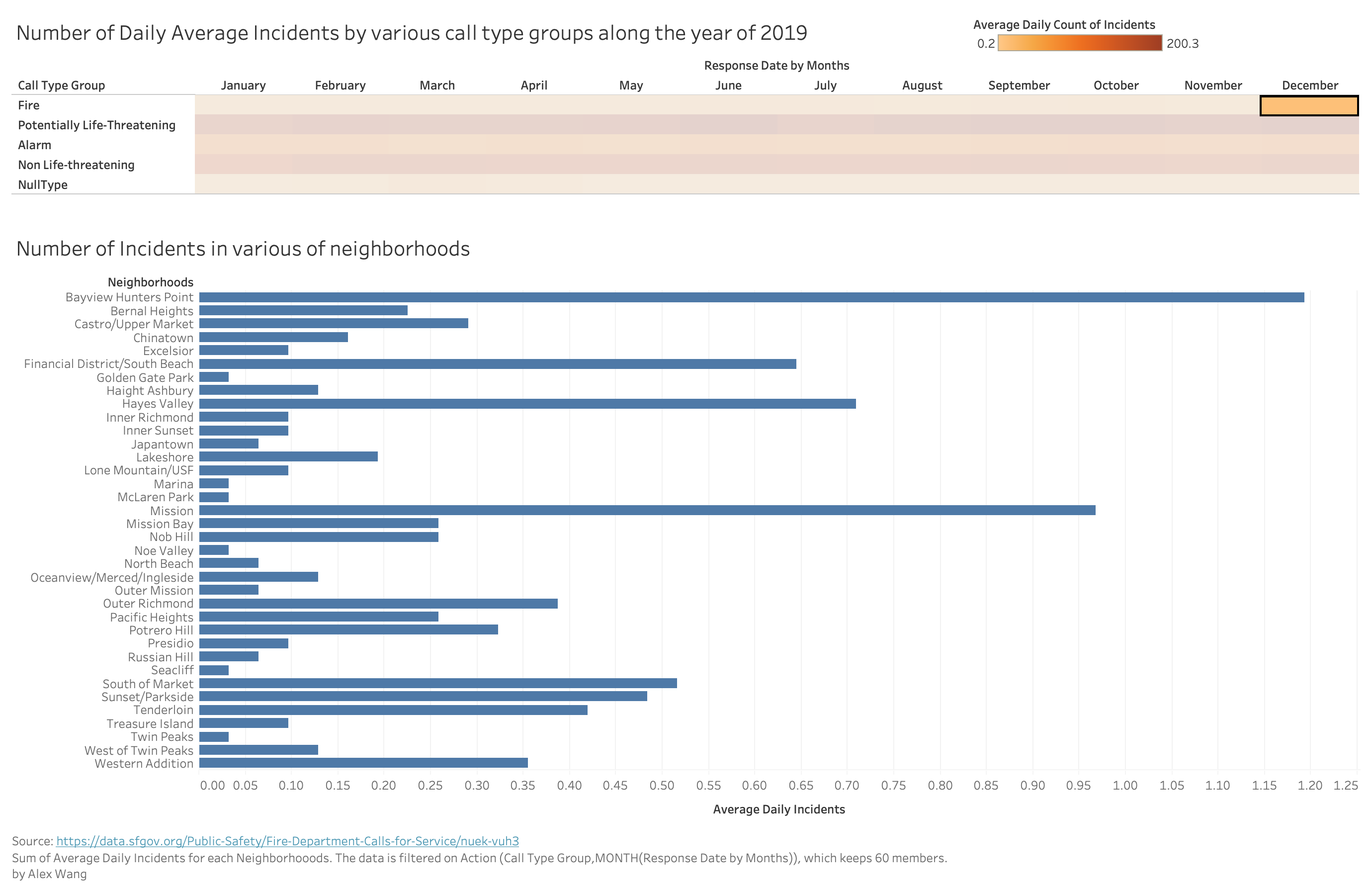
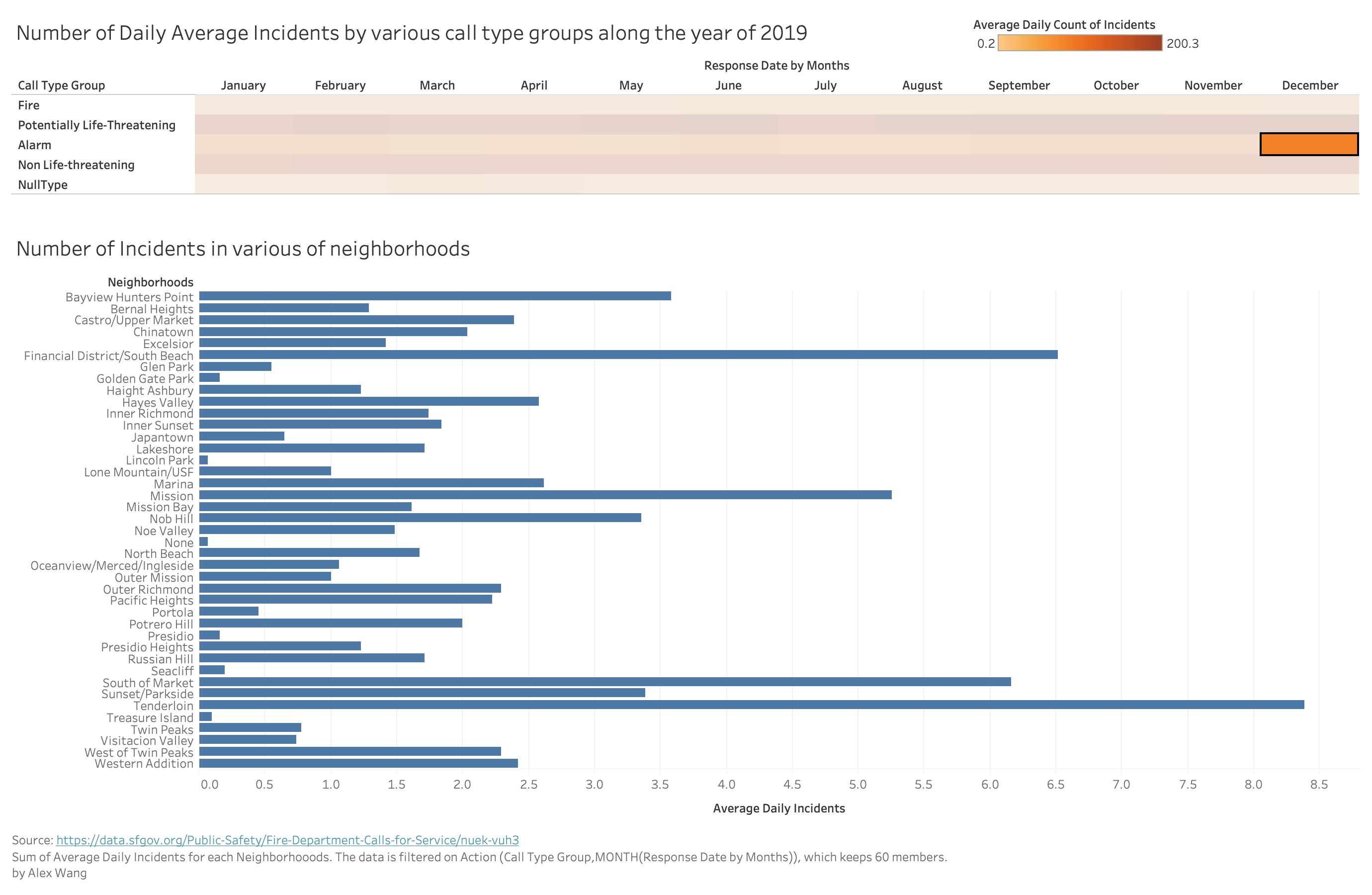
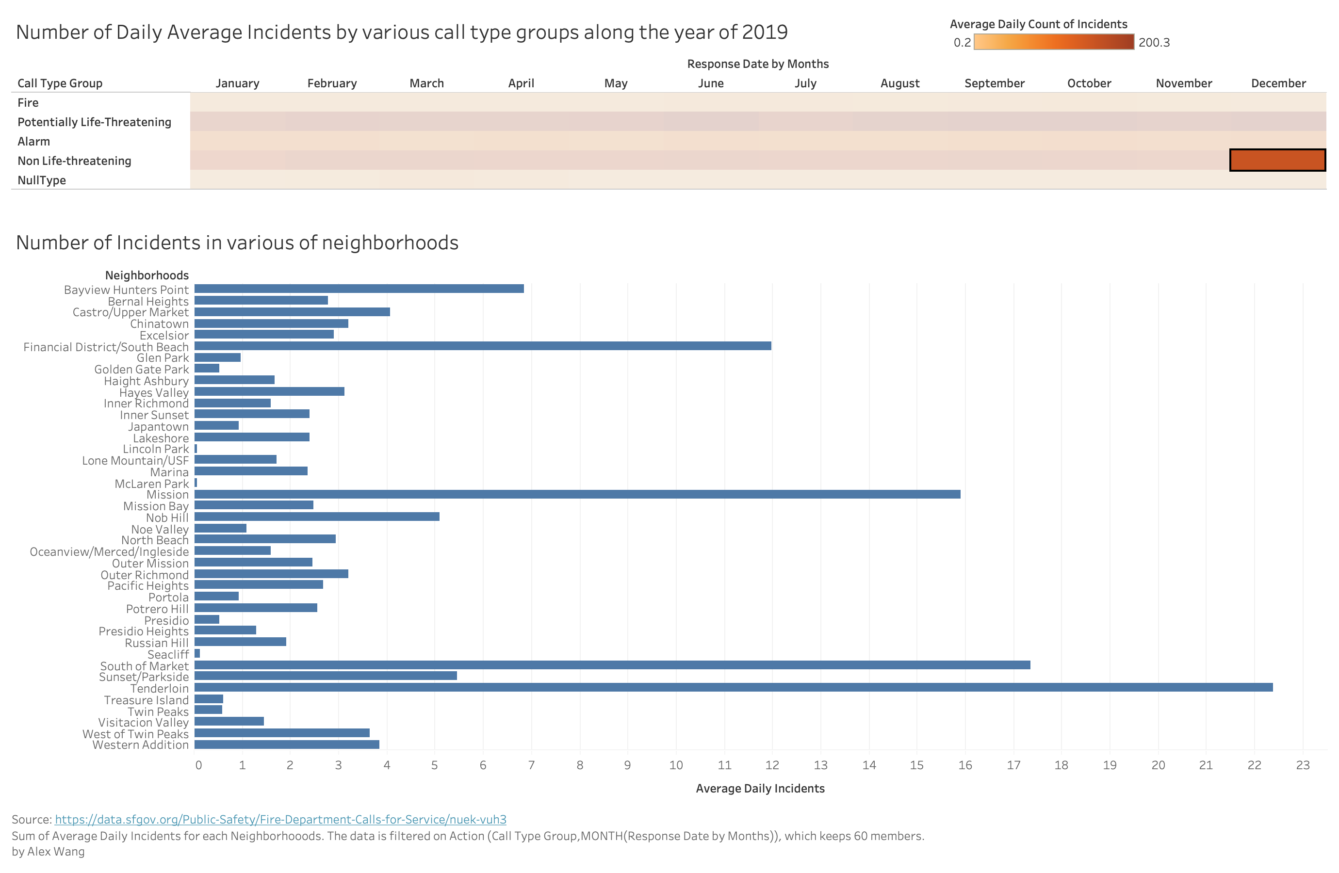
For heatmap, readers can click on blocks on the heatmap to see the data for a specific month and a specific call type group. When a block is chosen, the bar chart would change according to the month and call type group and show values of every neighborhood.
For bar chart, when hovering one bar, that bar would be "highlighted" and its value would show.
Interpretation: data encoding
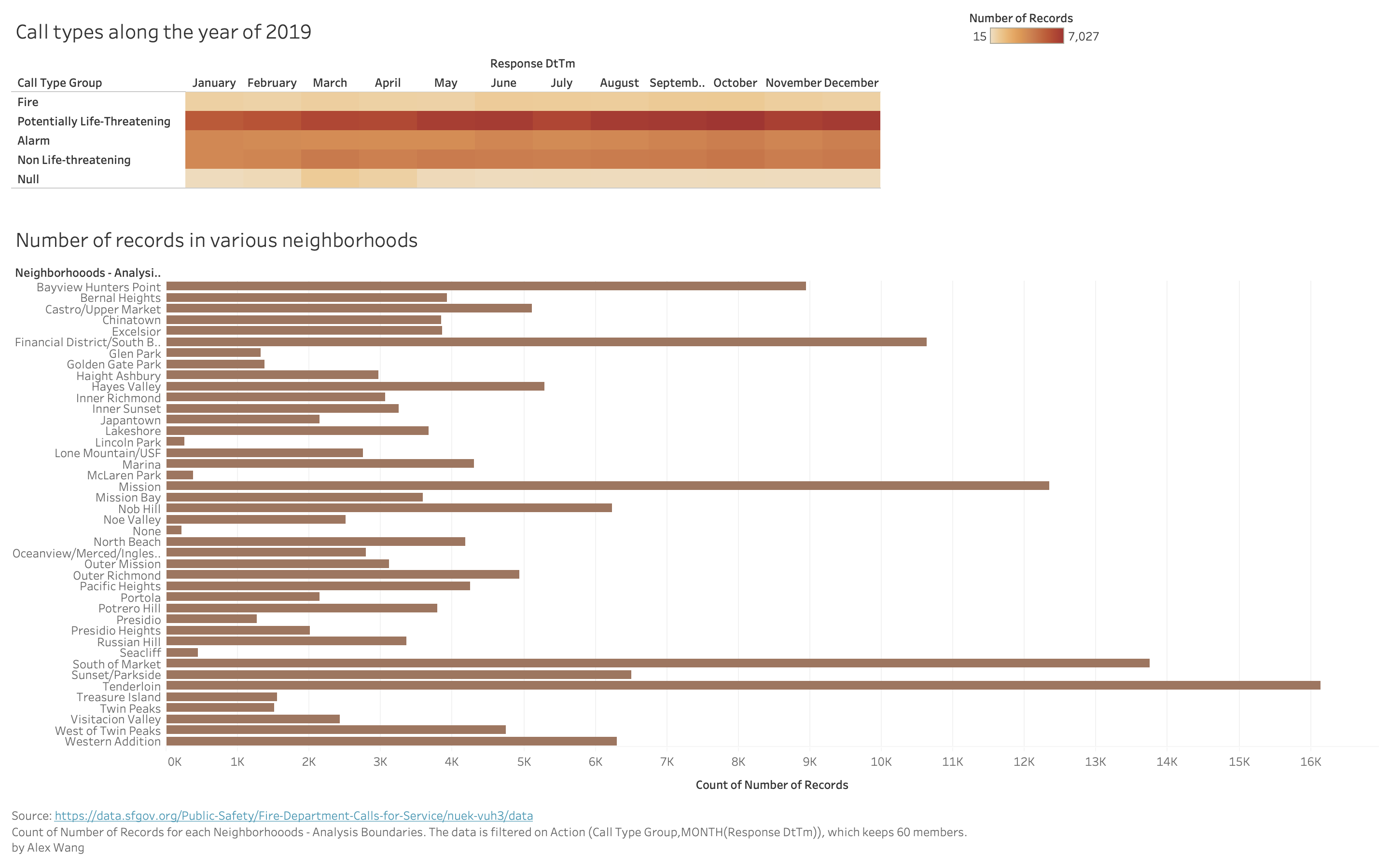
In the heatmap, the color diverging in boxes indicates the average daily count of unique incidents, the x-axis of heatmap is the response date and time of SFFD's action in months along the year of 2019, and y-axis is the call type.
In the bar chart, each bar represents a neighborhood and the length of bar is the count of incidents. The longer the bar, the more incidents were in that neighborhood. The bar charts are not sorting by high-to-low values(alphabetic, instead) because it would be too much movements when each click of heatmap-block would cause a change: since there are 42 neighborhoods and fixed position of them would help the reader locate specific neighborhood more quickly. Also, for the same neighborhood readers could have a chance to see that it might be leading in one call type group, but not in another.
Theme related findings
Firstly, in the heatmap, we could see the comparison between months to know that how the fire calls distributed: there is actually no obvious huge difference of numbers of fire incidents among months. Therefore it seems that fires are not more likely to happen in some seasons or holidays, and firefighters are not having obvious "busy season" according to information we have so far.
Moreover, take the example of Tenderloin, it often had most of calls in potentially-life-threatening, but it was not always the one with most fire calls, then the data could be potentially useful for SFFD to deploy specific more resource according to specific neighborhoods to rescue faster.
Inspiration:
Inspiration of drawing legend: https://blockbuilder.org/sjengle/22051097a8090fa227cbd80cdc2bad03
Inspiration of drawing heatmap: https://blockbuilder.org/sjengle/47c5c20a18ec29f4e2b82905bdb7fe95
Inspiration of applying interactivity: https://observablehq.com/@sjengle/interactivity-lab?collection=@sjengle/interactive-scatterplot
Progress from feedbacks
Feedbacks on prototypes and my changes according to them:
Originally the prototype had some problems:
Firstly the "number of records" was used, and that was not recommended, because in the dataset, one incident could be counted for multiple times(appear in multiple rows). Therefore I changed to group the dataset by incident-id to make sure that each incident would be count only once.
Secondly, there was a lie factor problem that values for each month were sum, and since different months are not with same days, some months might have larger value probably because it contains more days, and comparable values are not extracted correctly. Therefore later I switched to daily average to exclude the impact of different days in months.
Original prototype
Planned interactivity
When clicking on specific box on heatmap, the relavent bar chart for that call type at that time for all neighborhoods would show.

Connection to the project theme
This visualization explore several situation about works in SFFD. Firstly it shows how different call types take parts in all number of calls, so that we could know what kind of works do the SFFD do. For example, we would know that fire calls is not taking the major part of calls to SFFD. Also it shows the call type distributions along the year, and we could know that the calls to SFFD is not dependent on season or month or certain holidays, etc. Furthremore, if we switch between different data types, the specific number of calls for the same month on neightborhood would be different, so it could be potentially useful for SFFD to deploy different resource near different neighborhood, etc.