
Jaden Hamid
CS Major, University of San Francisco
Expected Graduation: 2021
jnhamid@dons.usfca.edu
Hey guys, I'm Jaden. I like to surf and my fav langauge is java.
Skills
Jaden Hamid

These are the data visualizations that I did in Tableau then implemented into D3.js
My data was provided by Data SF. The license is here.
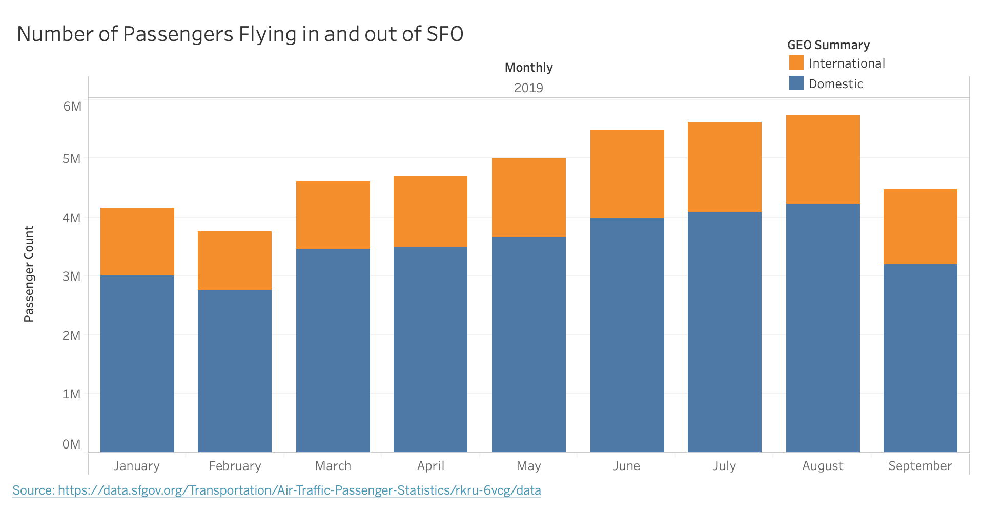
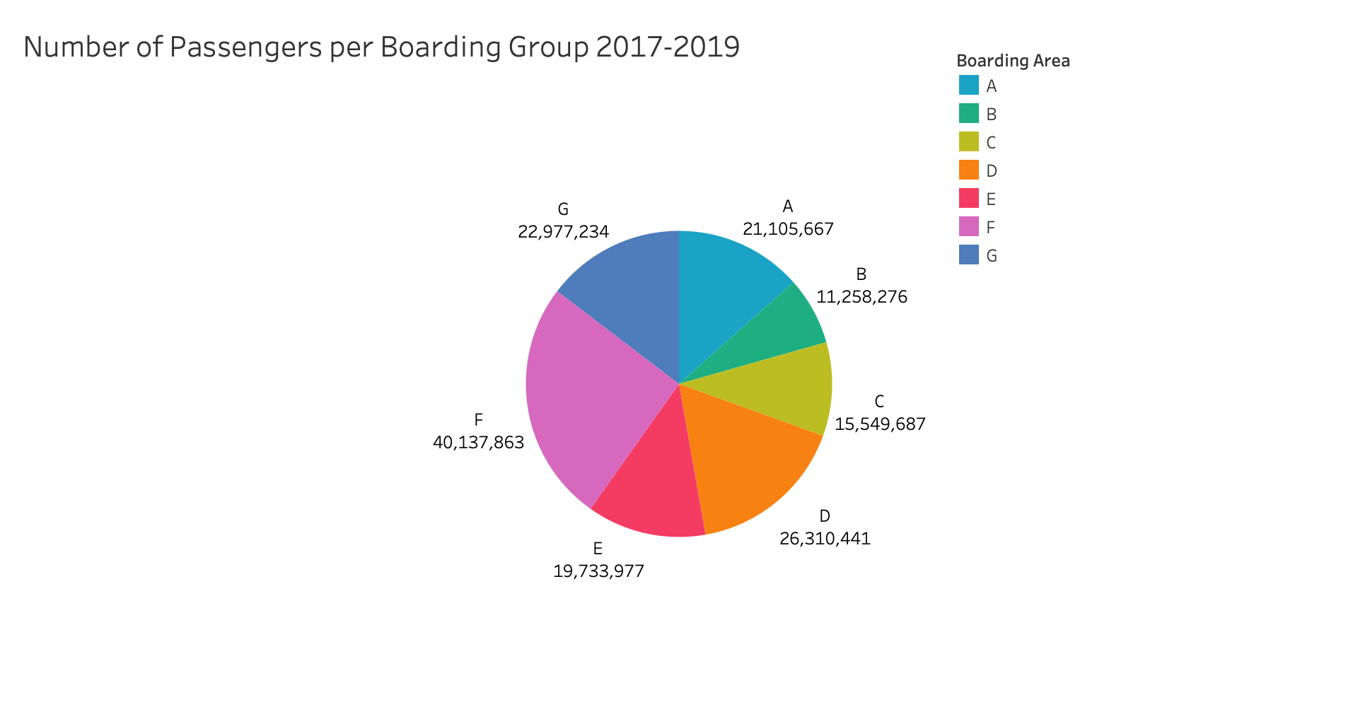
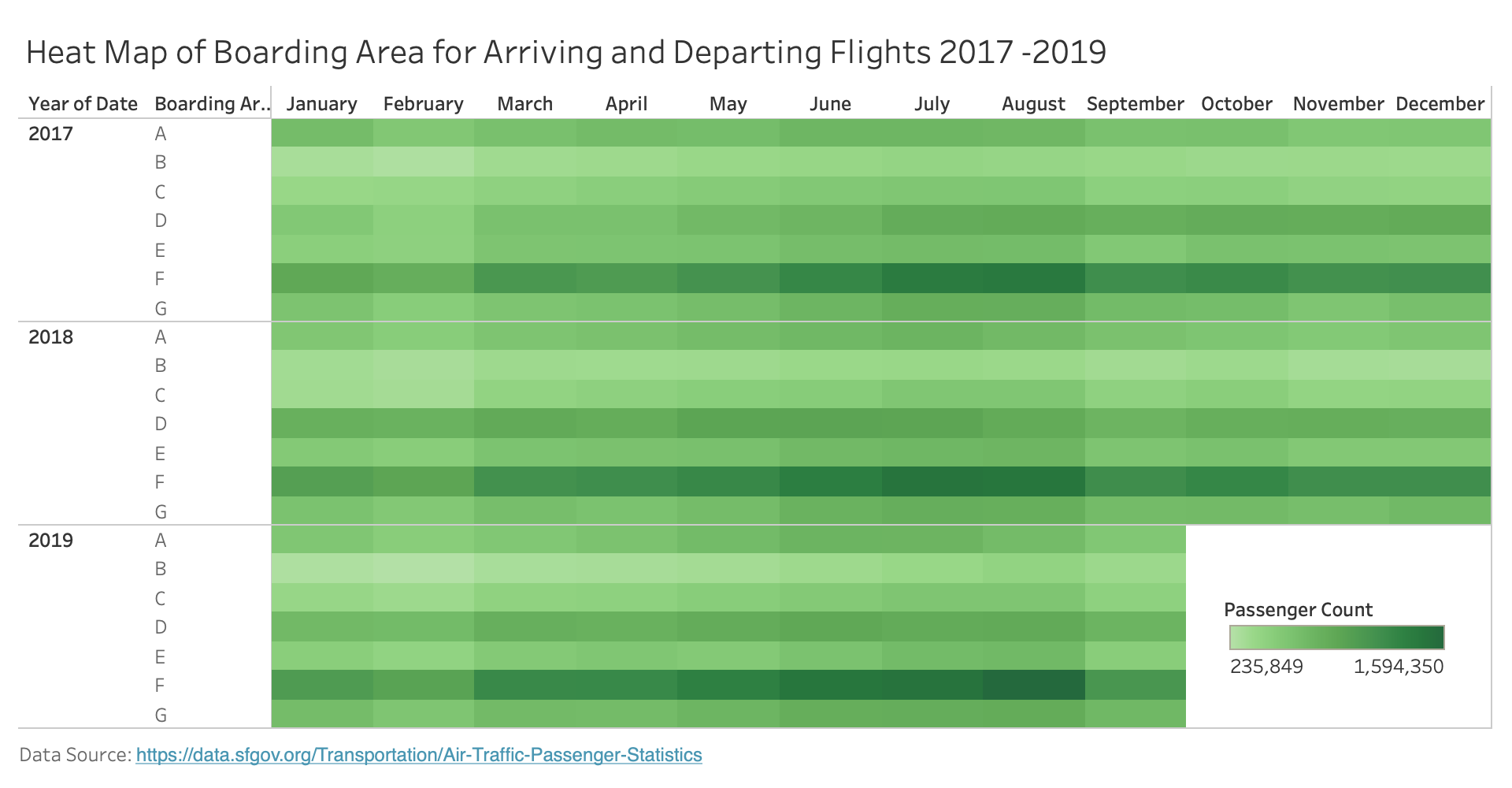
San Francisco International Airport data on Landings Statistics (DATASF).
I used a three column data set for the stacked bar I used 2 a data column set for the pie chart
For the bar chart, I really only cared about the passenger count, the month the flight occured, and whether it was domestic or international.
For the pie chart, I really only cared about the passenger count, the boarding area
Here are the examples that I made in Tableau. Click to expand
Here are two of those implemented into D3.js
Acknowledgements
Stacked Bar Chart Inspiration
Legend Template
Pie Chart Template
Thanks to Sophie Engle for their suggestion to do something with the visualization.
My data was provided by DataSF. It's full size is 12 columns by 21.2k rows. I believe I should earn a A for this assignment. I made my 3 prototypes in Tableau and then implemented two of those into D3.
Jaden Hamid
CS Major, University of San Francisco
Expected Graduation: 2021
jnhamid@dons.usfca.edu
Hey guys, I'm Jaden. I like to surf and my fav langauge is java.