Stacked Bar
by Aditya Dixit
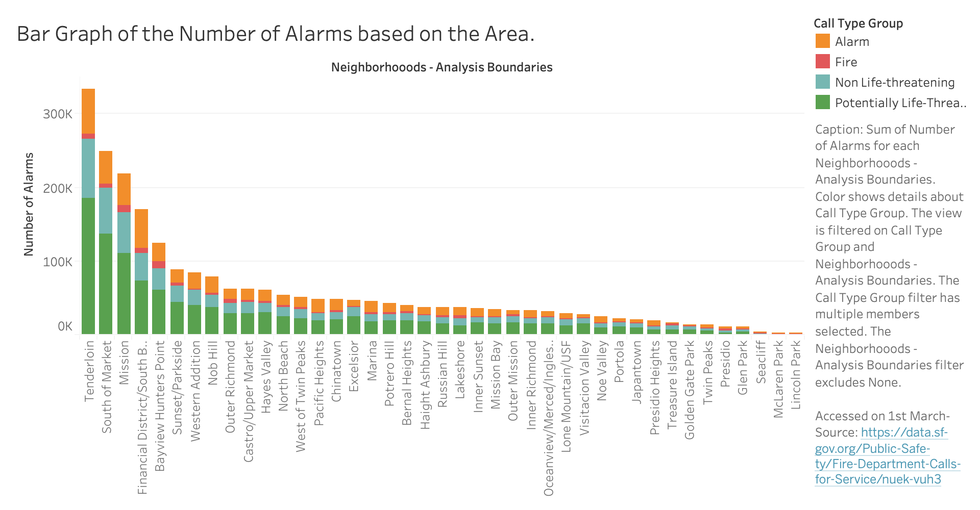
This is the original tableu prototype
Group Feedback Sessions
| Feedback | Changes |
|---|---|
| the caption might be better outside the chart| I didn't like the position of caption. Also there was no interactivity section although he talked about his planned interactivity. | Changed the location of the caption to the bottom and added the interactivity section |
| Color blind prone | Changed the colors to make them more relaateable and moderate. |
| Neighborhoods, therefore slight LF. | Treid to make it more readable at the bottom |
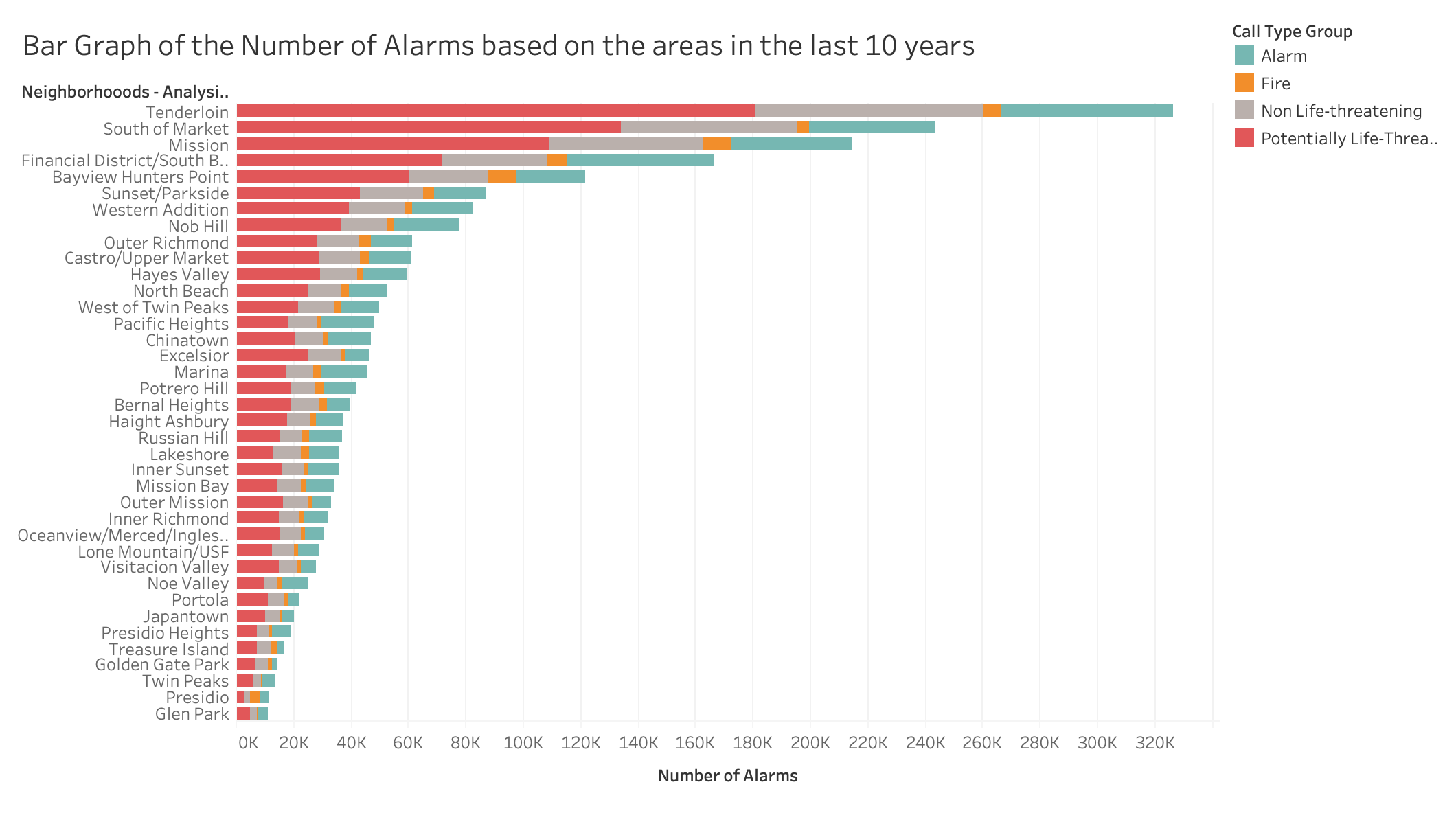
| Looks good but there is a lot of text on the right side, also rotating it so the text isnt sideways could help. | Changed the orientation of the graph to vertical to horizontal |
| Seems good! Good use of the stacked bar visualization type. What more components or interaction could you add to enable discovery and exploring? | Will add more interactivity and added a special calculation |
| You may want to add some further interactivity or a supplementary chart to add complexity to this and strengthen the relation to the overall theme. There may some lie factor issues depending on the population of each neighborhood, which would impact the number of alarms, so you may want to do ratios rather than just number of alarms. | I could find the ratios however, the visualization is a good enough ratio rather than the calculations |
| I appreciate your ambition to include the range, but you will almost certainly need to cut down the amount of data you are looking at. The entire data set is too large to perform on-demand filtering on the client-side. Other than that, I really like it. | I cut down the amount of data to only focus on ten years |
In terms of the peer feedback that I received, it was clear, that firstly I had a lot of data, and secondly, the orientation and the colors of the graph were something that needed to be rectified. As per the professor, the colors were also not relevant, so I ended up changing up the colors to make them more suitable. I also did some wrangling that I only included the neighborhoods with the total number of alarms is greater than 10,000, since there were some places that were small in population and/or had a lot of fewer calls, were excluded.
Special Calculation
I also added a special calculation column, where the response time, based on my definition, is the difference calculated from the time the call was received by the dispatcher and at the time they were at the scene. I wanted to see how long the fire department took to reach a certain area based on the call type, to see how they give importance and if also, distance does matter, or also the type of call, especially for fire and life risk calls.
Interactivity
I plan to add some sort of hover over effect so when the cursor tooltip goes over the bar, it shows information regarding the alarms, the neighborhood, the total number of alarms, and then the average response time. I also ended up adding some cool effects as well for the bars when it loads. The tip was very useful since it is able to showcase certain extra information that is not displayed visually.
This is the updated tableu prototype
This is the D3 Implementation
Interpretation
In order to understand that stacked bar chart, one needs to look at the axis. The Y-axis represents the different neighborhoods in SF while the X-axis represents the number of alarms, at 20k intervals. If you hover over the specific bar, the mouse tooltip, one can see the type of call, categorized based on an alarm, fire, non-life threatening life-threatening and also the number of alarms for that call type, and the average response time for that call type in that area. Some of that information gets hidden based on the size of the bars, and the hover info helps to give more detail
Analysis
It is interesting to note that certain areas that have tendencies to have higher crime rates, also have a lot more fire responders, because the firefighters end up going with the paramedics or also, like the Tenderloin, there are a lot of medical emergencies in general. This shows a clear trend, where the number of alarms is mostly raised due to potentially life-threatening emergencies and that they are the majority of the alarms in all the cases, which was interesting for me since I would expect the fires to be the most common call for the fire department. It is clear that the South of Market and the Tenderloin has the most responsive and the top 4 areas have a lot of alarms, however, the other areas have a lot fewer alarms in comparison, since it goes down pretty quickly once they leave those areas, since it is a lot more residential. Now if we look at the response time, it is the lowest for the life-threatening emergency, which makes sense, followed by the fire. However, it is interesting to note that the fire call takes 15s in the financial District to reach, while in the mission, it takes 8s for reaching a fire call.
Conclusion
This midterm assignment helped me better understand how to wrangle a large set of data, work with my team with a common purpose regarding out SF fire dataset looking at the correlations of the type of calls based on neighborhood and it was clear, my visualization was able to do that. I also understood how to make a visualization more interactive, and also add effects. Finally, I was able to enhance my understanding of Javascript and also utilize a complex graph like a stacked bar to present data in a new manner.
Inspiration
I had to use many different resources, based on my previous homework code, professor Sophies data-wrangling techniques in order to implement the bar. I have attributed all those sources below.
AcknowledgementsBar Chart with Tooltip: Mike Foster
Legend and Axis Idea
Tooltip Explanation